Guest Room: Round 1
When we moved in to this house back in August, there was so much to tackle, I felt like it would be helpful to have on finished room as inspiration. I (counter-intuitively) settled on the guest room for a couple of reasons. First, my in-laws' first visit was imminent, and I felt bad about their accommodations in our house in Boulder, where they slept on an air mattress on the floor in the computer room. Second, I was building the room around a number of pieces I already had, so I thought it would be quick and easy to pull together. You can see where this is going, can't you? Suffice it to say that 6 months have passed, and I am very excited to pull the room together before Barb and Pete arrive in two weeks for their third visit to the new house. Before I get to the final room, I thought I'd share some of the process, which I'm sure I made much more complicated than it needed to be.
First, the pieces I was working with. A mid-century campaign desk in a honey stain; a taupe, raspberry, and navy turkish rug; the hotel bedding we registered for when we got married; and a pair of block printed pillowcases I bought at ABC Carpet and home a decade ago.
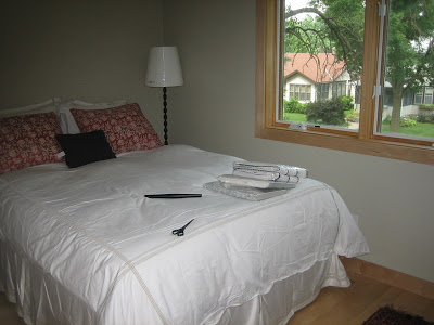
And the pieces that I needed. A dresser, a desk chair, a headboard, lamps, curtains, and possibly side tables.
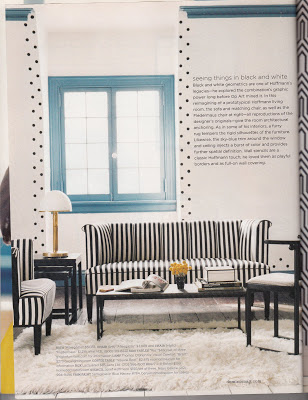
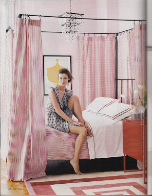
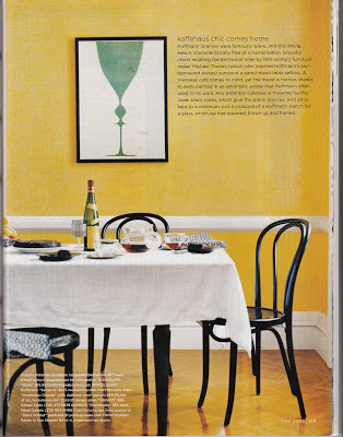
I think the inspiration as I developed version 1 was this story from Domino's May 2007 issue, "Viennese Revival."
I liked the idea of the bold black and white, the graphic shapes. I found some white curtains with black stripes at Ikea, a striped lampshade at Target, and brought in the silhouette Clio made me for mother's day and a pair of yellow lamps from our Boulder bedroom.


I found a bentwood chair on craiglist like the cafe chairs in the domino spread, planned to paint it black; tried this ikea chair as a backup.
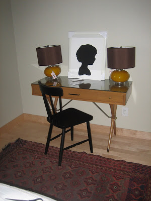
I liked the strong shapes, the crispness of the stripes. Only problem? What does modern Vienna have to do with turkish rugs, block printing, and campaign furniture? While I love to mix styles and am hopelessly eclectic, this felt like a bit of a mash-up even to me. After living with it (unfinished) for a few days, I returned the curtains to Ikea, put the silhouette in the master bathroom, and used the lamps in the basement den, bringing me back pretty much to where I began.
Stay tuned for Guestroom version 2...
First, the pieces I was working with. A mid-century campaign desk in a honey stain; a taupe, raspberry, and navy turkish rug; the hotel bedding we registered for when we got married; and a pair of block printed pillowcases I bought at ABC Carpet and home a decade ago.

And the pieces that I needed. A dresser, a desk chair, a headboard, lamps, curtains, and possibly side tables.
I think the inspiration as I developed version 1 was this story from Domino's May 2007 issue, "Viennese Revival."
I liked the idea of the bold black and white, the graphic shapes. I found some white curtains with black stripes at Ikea, a striped lampshade at Target, and brought in the silhouette Clio made me for mother's day and a pair of yellow lamps from our Boulder bedroom.


I found a bentwood chair on craiglist like the cafe chairs in the domino spread, planned to paint it black; tried this ikea chair as a backup.

I liked the strong shapes, the crispness of the stripes. Only problem? What does modern Vienna have to do with turkish rugs, block printing, and campaign furniture? While I love to mix styles and am hopelessly eclectic, this felt like a bit of a mash-up even to me. After living with it (unfinished) for a few days, I returned the curtains to Ikea, put the silhouette in the master bathroom, and used the lamps in the basement den, bringing me back pretty much to where I began.
Stay tuned for Guestroom version 2...

