Art You Can Make: Floral Silhouettes
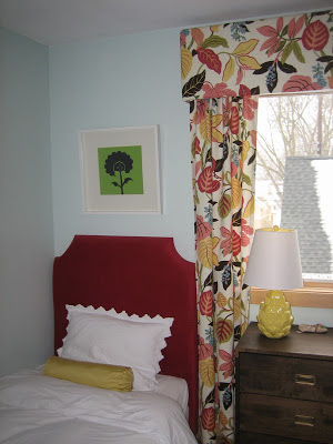
I've been using a pair of silhouettes over my girls' beds, but as I mentioned here, they were meant to be temporary. I thought about a number of options, but I really loved the graphic nature of the silhouettes to stand up to the super bold print in the curtain fabric. Standing in line at Home Depot the day we bought the materials for the girls' cornice, I was flipping through some magazine (maybe something like Home Renovators?) and saw an art wall anchored on a silhouette....of a flower pot. So cute! Not as been-there-done-that as a silhouette of a person, but still packing the graphic punch I was looking for.
You know how, once you've noticed something, you suddenly see it everywhere? Well, the floral silhouette has kind of been like that. I've always loved Donal Baechler's large-scale color paintings of flowers (my favorite designer Muriel Brandolini uses them in many of her interiors), and I was delighted to see this black version in House Beautiful.
[via The Decorista]
You know how, once you've noticed something, you suddenly see it everywhere? Well, the floral silhouette has kind of been like that. I've always loved Donal Baechler's large-scale color paintings of flowers (my favorite designer Muriel Brandolini uses them in many of her interiors), and I was delighted to see this black version in House Beautiful.
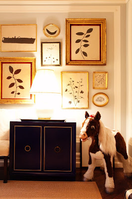
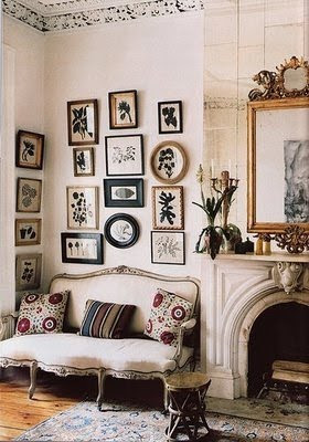
I love the impact of a whole wall of these flowers, and got tons of inspiration from the different shapes featured here.
[via The Decorista]
I'm also a fan of the simple, graceful leaf versions (and that banana?!) in this arrangement.
[Staghorn Fern by Hugo Guinness, available from John Derian, as featured in Elle Decor]
While these appear to be made by various methods in various mediums, I thought, why not just make it out of cut paper, like a proper silhouette?
I created a couple of versions.
A spiky flower, to pick up on the artichoke lamps and spiky scalloped pillow shams in the room (and had the most "juvenile" effect)

A softer, tulip-y version a la Baechler

A more delicate and intricate version based on the floral pattern in the drapes

And, the biggest departure, a sort of Indian blocked version, which, I will admit, is fully ripping off the Madeline Weinrib logo.
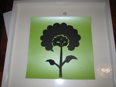
Let me know your favorites--I haven't married a cutout to a background yet, and they will look a lot "cleaner" once they're attached--and I'll share the final product in the room, with a full tutorial, tomorrow.
Okay, total spoiler, here's the Weinrib version in the room to give a sense of scale. I'm not sure if I'll do another one in the same size over Eleri's bed, or something a little less coordinated.

I created a couple of versions.
A spiky flower, to pick up on the artichoke lamps and spiky scalloped pillow shams in the room (and had the most "juvenile" effect)

A softer, tulip-y version a la Baechler

A more delicate and intricate version based on the floral pattern in the drapes

And, the biggest departure, a sort of Indian blocked version, which, I will admit, is fully ripping off the Madeline Weinrib logo.

Let me know your favorites--I haven't married a cutout to a background yet, and they will look a lot "cleaner" once they're attached--and I'll share the final product in the room, with a full tutorial, tomorrow.
Okay, total spoiler, here's the Weinrib version in the room to give a sense of scale. I'm not sure if I'll do another one in the same size over Eleri's bed, or something a little less coordinated.
