Oliver's Nursery
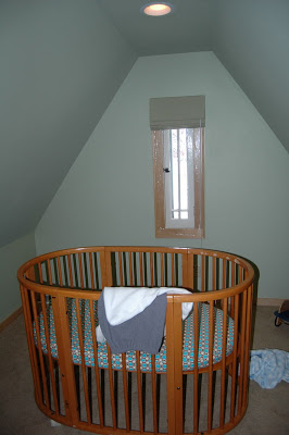
I'm doing a nursery! So excited. Here's the before:


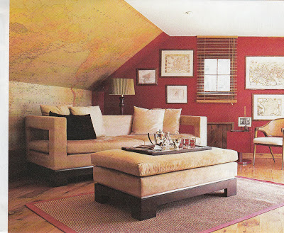
[via House Beautiful, 2006]
But coming into the space again, I was struck by the crib nook,
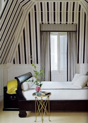
 and now we're thinking about tenting it.

So cute, right?
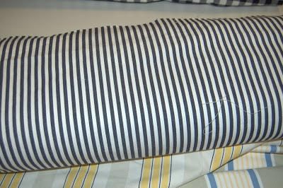
Maybe awning stripes?
We are keeping the green paint and roman blinds, and originally thought about bringing in navy as an accent, though Oliver's mom is thinking it might be too dark, and found this inspiration room, from the HGTV 2010 green home, to offer an alternative palette.
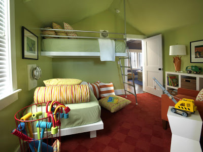
Well, you know I never say no to orange.
I'm thinking about vintage school posters for art
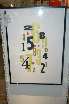
Or maybe some typography


The space is under the eaves of a charming tudor, presenting some challenges/opportunities in all those angled walls. Originally, I was thinking we would do a map treatment on the big angled wall when you enter the room (to the left of the crib in the last photo above), kind of like this.

[via House Beautiful, 2006]
 and now we're thinking about tenting it.
So cute, right?
Maybe awning stripes?
We are keeping the green paint and roman blinds, and originally thought about bringing in navy as an accent, though Oliver's mom is thinking it might be too dark, and found this inspiration room, from the HGTV 2010 green home, to offer an alternative palette.

Well, you know I never say no to orange.
I'm thinking about vintage school posters for art
Or maybe some typography

[Ikea]
Some great storage, a sweet spot to sit, a lamp or two. The creative juices are flowing. Stay tuned!

