Multiple gallery walls in one space: issues to consider
Are you ready for more art wall proselytizing? Well, here we go.
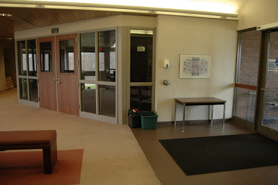
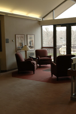
I recently framed and installed 30-some pictures from a local photo contest in the Mendota Heights City Hall. The municipal building had lots of bare walls, and most of the art that was up had the sort of muted color and generic subject matter that I associate with this hotel art fire sales. Remember those?
Here's the before:
To bring some life to the space aesthetically as well as a sense of community, they brought me in to make the most of what they had: photographs of their city taken by its citizens.
We decided to go very simple on the frames, and to have all the frames match. This brought unity to the project and simplifed my job by eliminating one of the major elements to consider (balancing the tones and types of frames in a mixed arrangement), but the project still had plenty of useful lessons.
1. Groupings should have the same overall height
Just as in furniture arranging, you want to bring the eye around the room in an even, measured way. Groupings that live at very different heights will create a visual rollercoaster. In this space, despite a mix of horizontal and vertical arrangements, I made sure that the groupings maxed out at the same height. This can apply to single pieces in a room or throughout a house where sitelines run from room to room. When you create a standard height this way, hanging something very low or very hi can be quite fun and unexpected.
2. Repetition creates rhythm
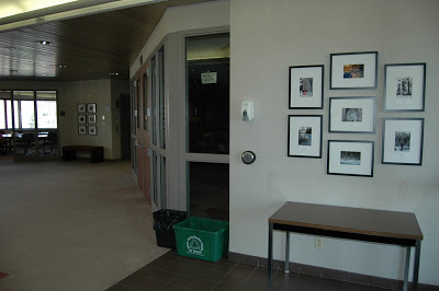
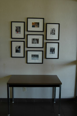
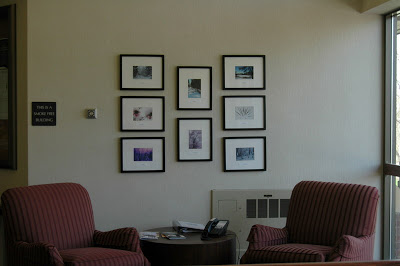
In a big space like this, there are two viewing experiences: first, the graphic impression of the frames, then the more intimate viewing of the content. To create a sense of rhythm in the frames, you can riff on one arrangement in another. In this case, the arrangement by the front door has three horizontal frames flanked by two verticals, and this relationship is inverted in the grouping over the chairs, which has two vertical frames flanked by three horizontal.
3. Contrast restful and energized arrangements
The photo contest had three winners in each of three categories. To delineate the honor, we blew up the winning photos to 8x10. Originally, I planned to mix the larger and smaller frames, but once I got them all onsite I realized that I had too many to fit on the three walls we had planned to use, so we made a "hall of winners," top. The arrangement, determined by the orientation of the nine photos I had to work with, feels quite energized. To calm the eye, I did a straight grid of 6 horizontal images on the adjacent wall.
4. Subject matter/ placement
The content of the photographs in this case fell mostly to two categories: scenic images of nature, and pictures of people and animals. The scenic pictures could be enjoyed from a distance, but it's human nature to want to see pictures of people and animals that we might know much closer up. In this case, I grouped the scenic pictures over the chairs, where there is no access to get up close, and placed the images of people and pets over the bench by the conference room, which invites people to take a closer look.
Lots to think about, but when you know the principles to follow, it all gets a little easier.
Also goes to show that you can create a dramatic gallery wall (or group of them) without spending a ton of cash. They already had the photos, and we used the ReStyle frames from Target, which are about as inexpensive as you can get. When hung en masse, they have a custom look, don't you think?
If you would like help creating a custom gallery wall in your home or office, email me at heather@heatherpetersondesign.com to inquire about rates.


