Ottoman fabric
Oh, the ottoman.
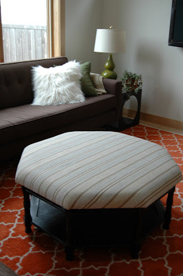
When I bought this octagon cocktail table on a whim at a thrift store, I didn't plan on turning it into an ottoman, so I wasn't really considering how I would design the thing. When I did start ruminating a while back, I quickly realized there was a problem. It's called a bright orange moroccan tile rug.
Don't get me wrong: I LOVE my living room rug. Orange is our favorite color, and I think it has been established that I love all things Moroccan and all kinds of repetitive graphic patterns. The trouble, when brining in other fabrics, is the scale of the pattern. When we first moved in, I bought the Parker Armchair from Crate and Barrel only to discover immediately upon bringing them into the house that the two patterns fought each other, despite a coordinated color scheme and similar points of origin (the suzani and the moorish tile are both middle eastern.) It was all about the scale.
Yet, if I was designing this ottoman based on the lines of the piece, I would definitely choose a large scale ethnic pattern, not unlike the embroidered indian fabric on the inspiration piece. Since the room couldn't take a print like that, I had to come at it another way. I already had a brown couch, a green armchair, and a flokati pillow for solids. I already had an embroidered african textile and block printed throw pillows for small scale pattern. Pattern-wise, the room needed a not-too-solid textured neutral, or a stripe.
Also, I should mention the other problem: money. After the paint debacle, the fabric had to be cheap. There would be no vintage suzanis or kuba cloth or excellent dhurries for this ottoman, no sirree.
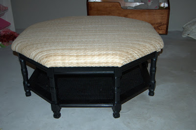
I found a great heavy duty fabric in a sort of basket weave that mimicked the rattan of the table's bottom. Even better: it had a sort of rubberized finish which seemed durable, and it was a neutral straw with some white running through it. To be honest, I really waffled on this, but in a fit of impatience decided to put it on after I opened up the canvas dropcloth I had picked up as a neutral alternative and discovered big black imperfections in the fabric. Thanks again, Home Depot.
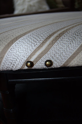
I immediately felt that it was too yellow, too beachy, with the black base. Don't you think? On a white or natural wood base and in a beach house, it would be perfect. One last pass at the fabric warehouse turned up a fabric I liked, for $7.50 a yard. It was off white and a sort of golden tan to pick up on the paler neutal colors in the room, and best of all, it had a dark brown to black pinstitch running through it, which both gave it an ethnic vibe and tied it in to the black base. It was a stripe without being too stripey. I decided to add the fabric right over the straw, which was much stronger than the new fabric and gave the piece a stable base.
While, again, I didn't really want a directional fabric on the piece, I do like the stripe in the room. I like the way the cream and tan sort of cool down the other colors, like the hot orange rug and the hot pink, green, and blue in the 70s oil paintings that are hanging in there.
But I'm not finished. The next decision: whether to glam it up with details or leave well enough alone. I have these brass and black nailheads that I was planning to space about an inch apart all along the edge (back when I thought I was going totally drop-cloth neutral).
And I have a tube of gold rub n buff, just ready to trim out the details on the base. What do you think: glam it up, or keep it simple?
Progress, people, progress.


