Reader Design Dilemma: What to do with a brick planter entry divider
Renee writes to me with a fun dilemma. I'm going to give it to you in her own words, because I think she captures that feeling we all get when a built in element has us stumped:
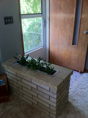
So there's this thing in my house. It's a brick thing at the front door, sort of delineating the world's smallest foyer from the (also small) living room the door opens into. I generally love it as a 60's element, I love the color of the brick and now that my kids aren't toddlers it's not as hideously dangerous as it used to be. But what do I DO with it?
Check it out:
My first reaction, to be honest, is that I kind of like it. But Renee says that this is where plants come to die, and I know that if this was in my house, it would immediately accumulate keys, mail, bags, and Disney princess dolls.
Option 1--and Renee alluded to this idea--is to make it a bench. At 22" tall, it's about 4" higher than a standard seat. and adding wood on top would just add to that problem. To make a bench that looks like it came with the house, I would see if the top stone slab could be removed, and replace it with a 1" thick piece of wood with a nice grain in a stain to coordinate with the wood trim. A 2" thick slab of wood would be in better proportion, but then there's that height issue again.
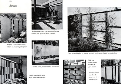
Option 2: build it up to create a room divider, better delineating the entry from the living space. To keep it feeling authentic to the house, built in 1962, I would look to a geometric treatment. Here's some inspiration:
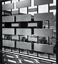
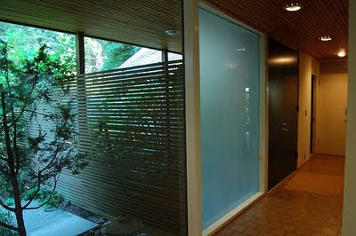
I'm a big fan of this one, because it would echo the horizontal pattern of the brick, and the dowels could make for fairly easy construction while keeping things open. Now, if Renee didn't want to physically connect the screen to the stone base, today's lightweight materials would allow for a screen hanging from the ceiling, like this:
[via designshrine.net]
Though, to be clear, I would stick to a pattern like the one above.
To add a layer of function, the divider could be built out as very narrow shelves, like one section of this guy:
[via stylisheve.com]
This would provide space for the aforementioned keys, maybe even an objet or two when the kids are a little bit bigger. Wouldn't this be pretty in a woodstain with some sweet little 60s glazed vases in the openings?
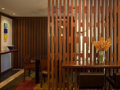
If these options feel either too closed off or too difficult to build, I would consider something with very simple lines. A horizontal wood slat feels true to the period, but allows the builder to choose just how much space to leave between slats. Horizontal would be nice:
And, really, so would vertical (love the connecting pieces in this one)
[via dcarch.com]
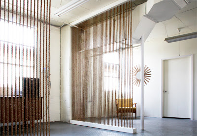
And then there's the possibility of a rope wall. I spotted this one over at the Brick House, and I love the sort of rustic simplicity of it. If you check out the blog, there are even basic instructions for the construction.
[via the brick house]
Problem solved, right? Well, there's one more issue. What do you do with that planter? With the narrow shelves, and the rope wall, the base piece of wood could cover over the planter opening as if it never existed. Both treatments are open enough on the sides that they wouldn't need to interfere with the light switch on the wall. The other screens are trickier, because they don't have bulk at the bottom to cover up the hole, while the slatted walls would run right into the lightswitch if they were built down the middle of the stone. In those cases, I say hang or build them behind the planter (on the living room side), and keep something leafy and green going simultaneously.
What do you think? what would you do with this brick divider if you really loved it and wanted to make it work?
Renee, I hope this helps!
If you have a design dilemma and would like some help, send it my way at heather[at]heatherpetersondesign[dot]com

