When unfinished is finished
I have a tendency to want things to be quite finished and pulled together. Looking at sneak peeks on Design Sponge and House Tour's on Apartment Therapy on a regular basis, I feel a growing appreciation for design decisions that truly make less equal more.
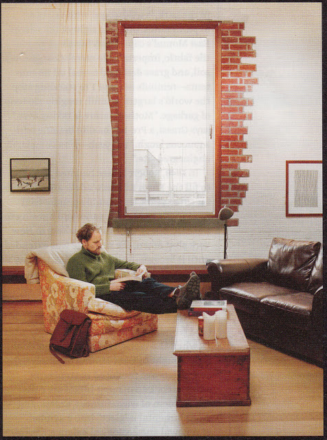
Digging through my inspiration files tonight, I stumbled upon this image form Dwell, March 2011.
This room does many things I typically don't like, including placing the furniture on an angle, using a coffee table with no rug, and having that coffee table parallel to exactly nothing (this is making me sound extremely uptight). not to mention art hung somewhat randomly.
BUT!
I am in love with that red brick border, and the way the randomness of the choice of which bricks to paint white and which to leave brick is so artful, lending credence to the other choices in the space.
If I lived in a loft, I hope I would take this kind of risk, and allow just enough unfinished business. Somehow it makes this space feel complete.

