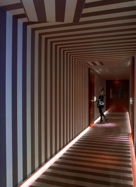
Hallways: Wild, wild wallpaper
Oh, the hazards of blogging: I almost forgot that I promised to round up hallway inspiration!
I actually had a lot of fun pulling these images together, despite the fact that I myself can't afford to wallpaper the upstairs hallway, the long boring space that I'm thinking of revamping next. And despite the fact that I lost this entire post and had to resource most of the images--twice. I know the formatting isn't consistent, but I'll tell you what: blogger just kicked my ass.
Anyhoo.
Anyhoo.
Bold Florals and Chinoiserie
No introduction necessary. I'll keep my oohs and aahs to myself.

Miles Redd in House Beautiful
 |
| Domino |
 |
| Meg Braff |

spotted here

Domino

spotted here
Concentrated Color!

Design Sponge via Charles Davis Styling

Design Sponge

Ashley Whitaker in domino

Kelly Wearstler for Chloe Sevigny, via Evie and Bluebell

Brett Bara

Domino

Eric Cohler in House Beautiful
And, of course, stripes. They work thick or thin, black and white, two-tone, or all out color. Traditional, modern, or funky. Talk about versatile: no wonder they're everywhere.
Horizontal!
 |
| Miles Redd again, in Domino |

spotted here


two via Abode Love

via do you love where you live
Vertical!
We've seen less of this, I think, but I love it in a long hallway to break up the tunnel effect.

spotted here

Miles Redd via Travel For Design

Swoonworthy via Inspire my house pretty
Take it over the top!

spotted here

via Hotel Chic
Now this last one is not technically a hallway, but when I stumbled upon it flipping through my Domino collection, I realized it must have burned itself onto my retinas only to remembered later. That's right, my plan for the upstairs hallway had been to do tone on tone raspberry stripes. Hmmm. So original!
 |
| Domino |
Well, I'm exhausted. what do you think: could you handle such a bold statement in a hallway? Or is it just too much?
