Exterior Colors
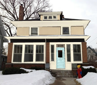
This week is all about progress with ongoing clients. I worked with a client on a whole-house (interior) paint palette as well as a design framework and some specific furnishing and rug selections, and they get so many compliments on the colors, they asked me to tackle the exterior. Which of course I was happy to do!
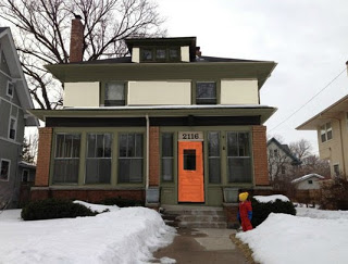
I love the balance of bringing green against the orange brick, whether with dark olive trim
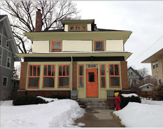
Pale green walls with ivory trim is a brighter take on the scheme, with charcoal mullions for contrast.
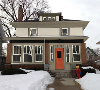
But green was a no-go, so we had a go at grey, another nice compliment to the orange brick.
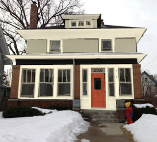
In the end we went with a lighter/ brighter approach.
It is the least "different" from the existing house colors, but it gives the best hint at what's inside (like aqua living room walls!).
What do you think: should the exterior of a house give some hint to what's inside?

