Re-imagining
Are you sick of hearing me talk about process in my own house?
I know that's what I love about the blogs I read, but I am also aware that I have a shocking amount to say/think/process/do on the topic, and that perhaps it is getting just a little bit.....boring?
Well. Sometimes, you just have to take a step back.
This is the challenge with both incremental decorating and the "collected" vibe: I have been working so hard to find the one piece that makes everything "work", I didn't really stop to consider if I like what's going on. I'm pretty sure this is a common phenomenon. Some call it "throwing good money after bad."
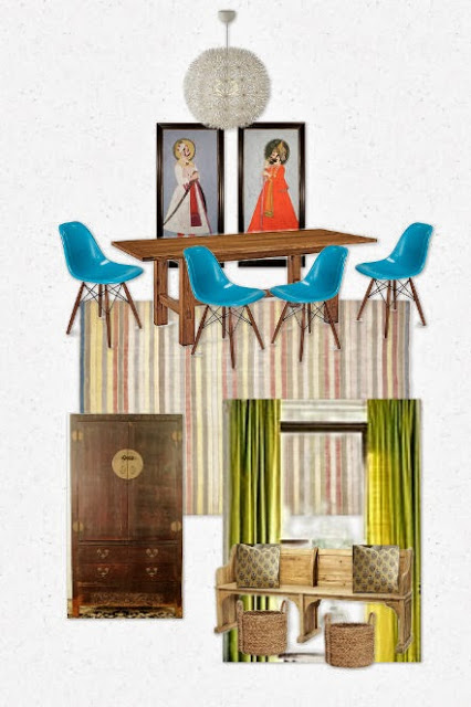
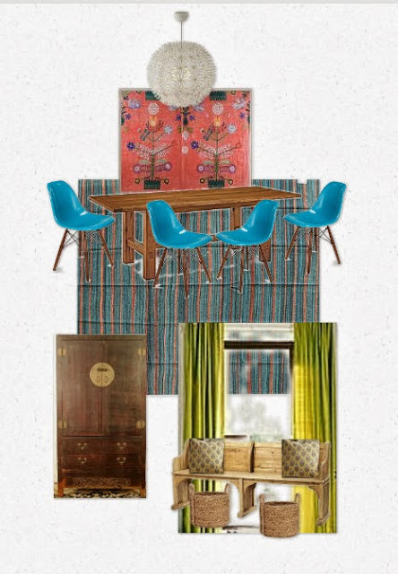
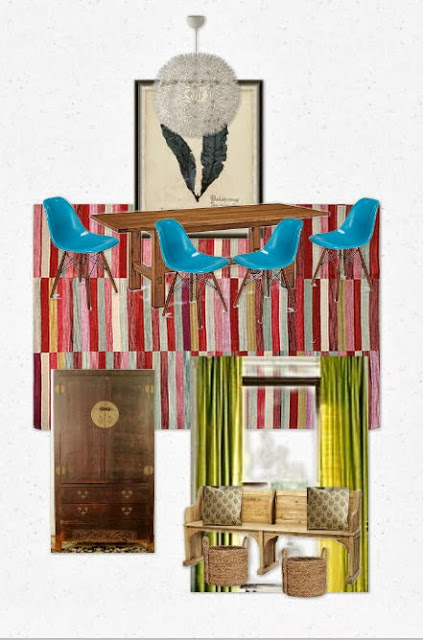
So I did what one does. I made a design board. Of my own dining room.
But first I asked: what do I love, what stays, what goes? (I'm a professional, but yes, you can try this at home.)
What stays: vintage blue eames chairs (someday: upgrade to dowel bases); church pew; chinoiserie cabinet; sale block print pillows from Pottery Barn; ceramic hex tile backsplash in the kitchen
What goes: the temporary art and the rug that I love love love, but which also represents where I was at 15 years ago. Turns out, these two pieces are majorly bossing around the palette in this room.
Could go either way: While I feel that the Maskros light is "over," I actually simply love it. It stays. And the chartreuse curtains? Well, I am not averse to swapping them out for some plain white Ikeas, but really, why?
And here's what I got.
Is this for everybody? Hell to the no. In fact, I may lose clients just posting this. That is A LOT of color and mish mash. But this is what I want: happy color, bold but worn in rugs, big, strong art, a slightly exotic feel, pieces with stories. A home that says: yup, we are interesting. Disheveled, but interesting. That's just what I want to come home to.
So....I'm curious. Which scheme do you hate the least?
Those Indian Mughal portraits at the top, quick: love or hate?
(Love.)


