Before and After
Don't you just love a good before and after?
It really makes it all worth it over here.
I wrote about this bedroom project and shared three possible looks here. But here's what she DID choose:
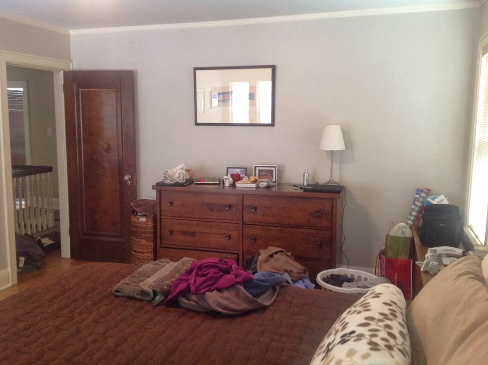
Here is the space before:
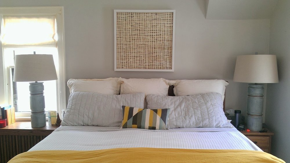
and after!
Some much needed texture, lightness, and personality. The biggest issue was breaking up all the brown and bringing in lighter tones (and one strong does of cheerful color!). The space was also short on softness with no rug, no upholstery, and aluminum mini blinds on the windows. Using a trio of euro shams filled in the wood headboard and gave more of the effect of an upholstered headboard, and fabric romans are a huge upgrade on the windows.
Before:
and after:
Before I came on the scene, they had already purchased the second dresser. It just needed a focus, which a right-sized mirror will do instantly.
Before:
And after (okay, progress):
These frames will house personal photos. Again the scale makes a big impact here, as well as hanging the art much lower. (They hung things on existing nails when they moved in--something people do ALL the time to avoid putting another nail in the wall!)
A few more:
Those lamps were a total score. They are more than 3 ft tall, which the overscale furniture really needed. and you know how I love the mix in patterned sheets for a mostly-hidden layer of interest.
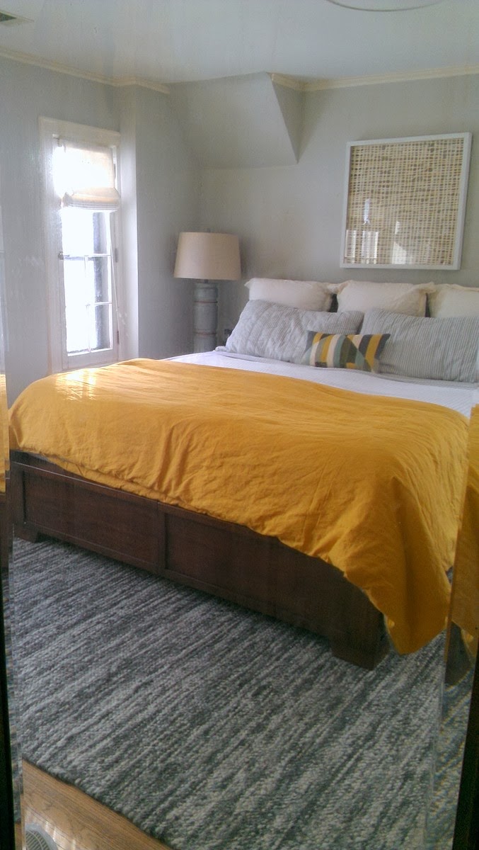
I took this one in the full length mirror on the closet. It's funny how different a room looks when you flip the image.
What do you think? amazing what a little "fluffing" can do.


