Striped Wallpaper: Hallway (Two Ways)
Yesterday I showed you plans for a striped powder room, based on my impulse wallpaper purchase in a bold brown and white stripe. Truth be told, I bought it for the upstairs hallway (but made sure I had enough for the powder room, if it came to that.)
When I put my original vision to paper, I wasn't so sure:
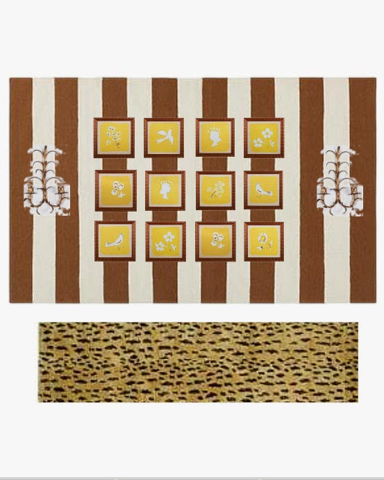
The striped paper, my grandmother's gold tole sconces (which I have mentioned many times but have thus far failed to photograph), all to set off my idea for a strong yellow and white abstract work, divided into a grid of white frames. I threw in the boucherite rug for good measure.
Only problem? When I saw my vision in something other than my own brain, it did't look like me.
So I tweaked.
MUCH better! (For me). I ADORE those yellow Paul Marrot prints. And I had to get my leopard rug in somewhere, right? The idea of the big abstract in the first scenario is to give a lot of movement against the stripe, but I think the hand-drawn quality of the prints does it in a way that is a little more ladylike, if less cool. A little more me. And of course, that's what matters most.
It's funny, when I saw it mocked up I realized that the grid of prints on the stripes reminds me of a tearsheet from many moons ago, from a Sheila Bridges project:
So good. In fact, I like the way hers meander off-center from the stripes, don't you?
So now I love my proposed hallway. But still....I am loving the powder room plans, too.
Do you have a favorite? Or....do you think the paper should go in my laundry room? My husband's vintage Smashing Pumpkins tour poster would look pretty good over brown and white....
Weigh in! I would love to hear what you think.


