Before and After!
Yesterday I wrapped the final piece or two in a girl's room. I showed you the early design boards here and gave you a little sneak peek here, but now it's time for a full before and after.
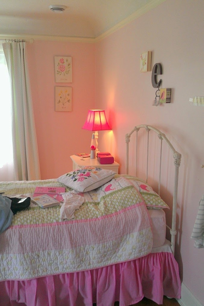
This is what we started with:
From the initial three directions, the clients chose this as their favorite:
The room feels much more filled out and finished. It is sweet, but not too sweet, and it will "grow up" really easily, both to full-on teen and even beyond.
One of these days I will get a real photographer out to capture some of these spaces, and style up bookcases and surfaces while I am at it, but for now, I think you get the idea.
Up next: her parents room.
This is what we started with:
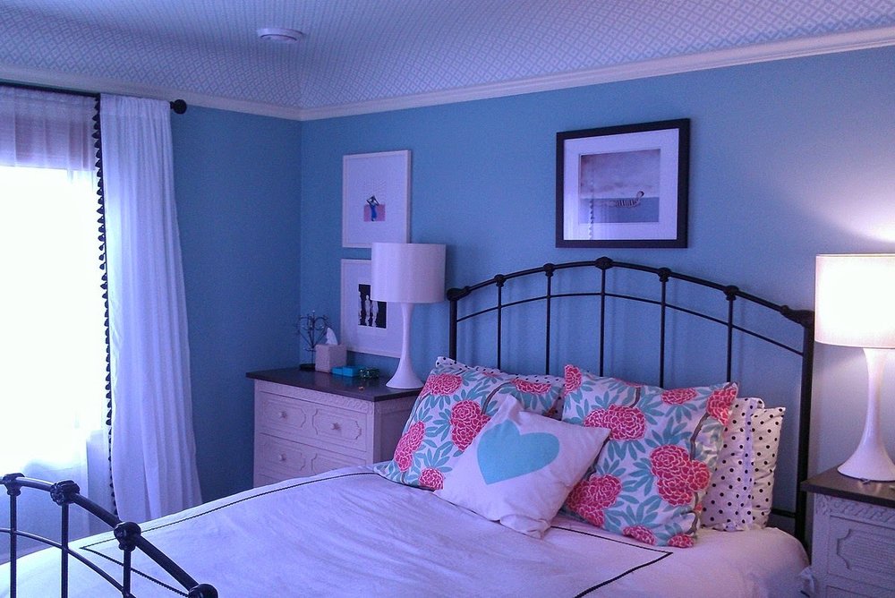
We agreed from the outset on blue walls, re-purposing a Queen bed frame that they had in the attic by painting it black, and wallpapering the cove ceiling. We also kept most of the existing layout as there was really only one wall for the bed. Generally, we wanted furniture that would grow with this 10 year old, coupled with youthful textiles and accessories. But there were still many decisions to make!
From the initial three directions, the clients chose this as their favorite:
But we swapped out the crazy pillows and switched to a tufted armchair:
And then, retail happened.
My clients are often surprised by how much goes wrong with retail (as opposed to custom or items that are to the trade.) Backorders, damaged goods, suddenly discontinued items, bad dyelots, you name it!
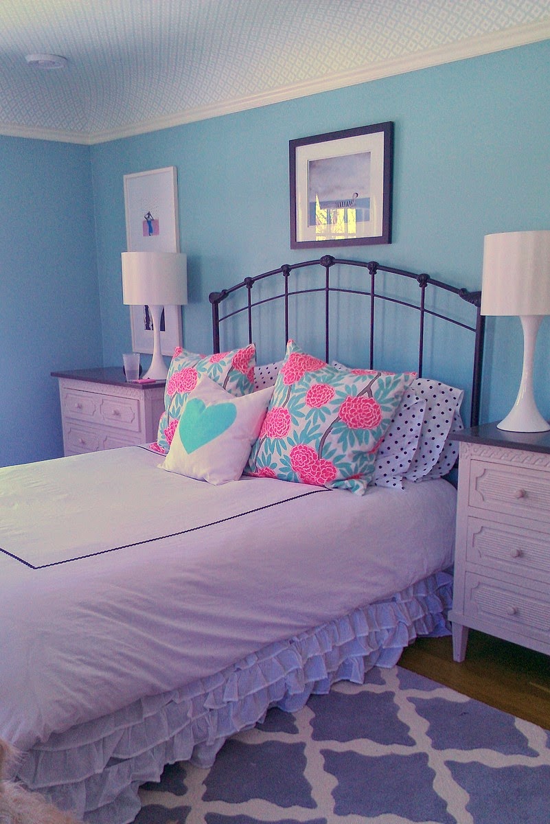
In this project, the initial rug we chose was too blue when it arrived, and those charming chests fell into the sudden discontinuation category. The upside of retail is that most of it is returnable or exchangeable, and with the new rug and chests (both of which I think are better in the end), we ended up with this:
Which translated into this!
A few more angles:
Before:
After:
Before:
After:
Before:
After:
Before:
After:
The room feels much more filled out and finished. It is sweet, but not too sweet, and it will "grow up" really easily, both to full-on teen and even beyond.
One of these days I will get a real photographer out to capture some of these spaces, and style up bookcases and surfaces while I am at it, but for now, I think you get the idea.
Up next: her parents room.


