Styling--Liz Caan Kitchen three ways
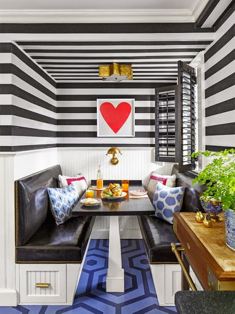
The other day I shared my obsession with heart art, and used an awesome kitchen by Liz Caan as an illustration. When I was writing the post, I could not initially remember in which magazine I had seen the kitchen, so, naturally, I googled it.
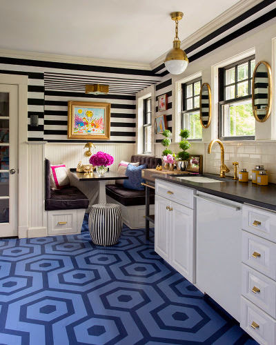
Though various internet machinations, I ended up finding several versions of this kitchen--each with different art. Amazing how one painting can change the feel of a room, no?
Though various internet machinations, I ended up finding several versions of this kitchen--each with different art. Amazing how one painting can change the feel of a room, no?
And what looks to be an earlier iteration of the space:
Here she uses a mirror in place of the art and a bell jar lantern in place of the visual comfort star flushmount. The floors are much more traditional, a little bit "country," and a cheeky framed poster hangs where there is now a wooden island.
Don't you just love seeing the way spaces evolve? Which is your favorite?


