Before and After: Tangletown Traditional
My husband and I are back on the photo shoot bandwagon!
I shared peeks of this transformation on Instagram last summer when everything was installed, but the full before and after is so much more fun.
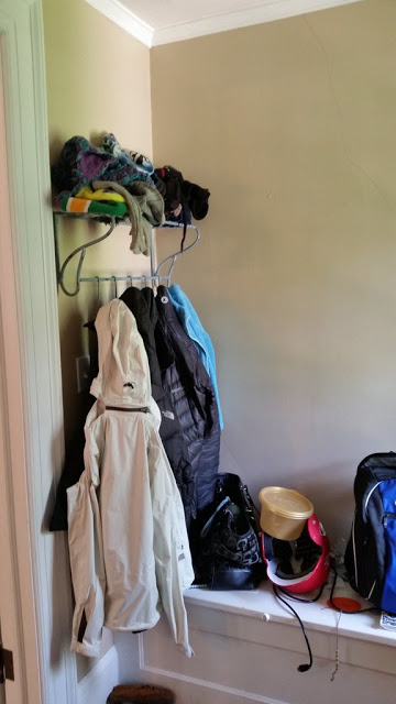
Come on in to this GORGEOUS 1920s house in Tangletown. When my clients moved in, it had received some "updates" that really weren't in keeping with the era of the house, and despite many lovely architectural details, the center hall felt a but unfinished.
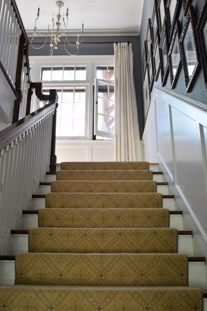
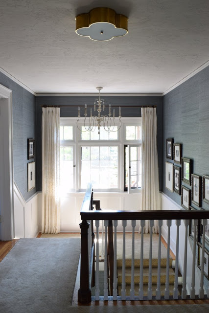
Our goal: to restore the central public spaces of the home to full glory. (And to refresh the small powder room until a full remodel happens down the road.) To do that, we added wainscoting, wallpaper, new lighting, a wool stair runner, traditional window treatments, and elegant furnishings. We knew the panelling was the right move when all visitors failed to notice it after the work was done! It belongs so well, it looks like it has always been there.
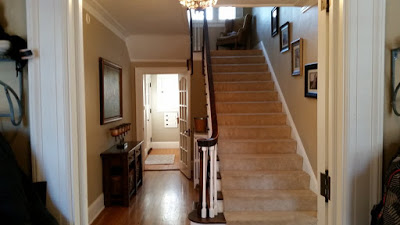
Okay, before:
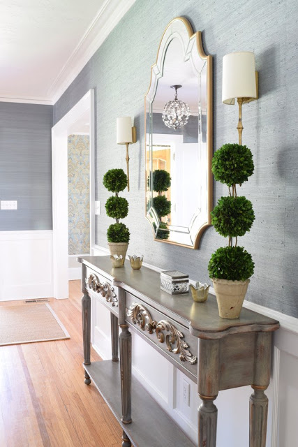
After!
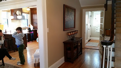
Before:
After:
The Entry Before:
and After:
Radiator in entry Before:
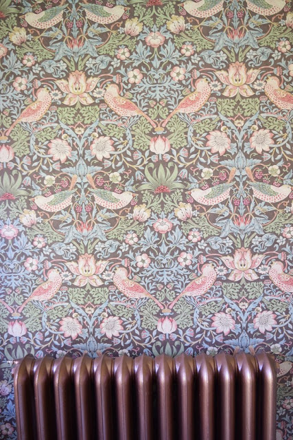
After:
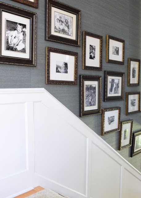
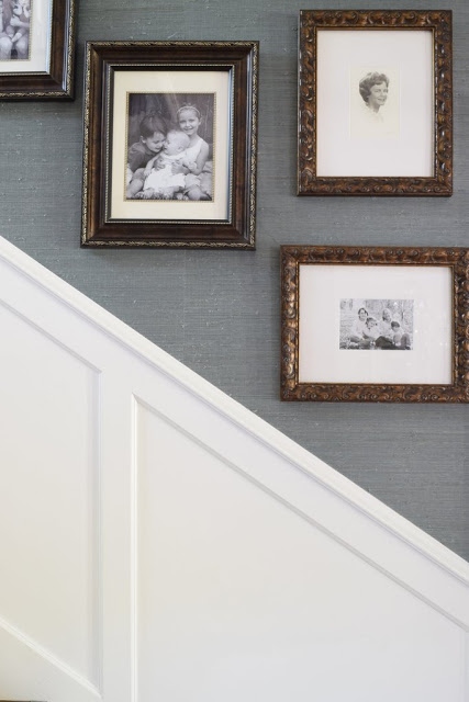
Stairway and landing before:
And after:
(I think the carpet is the one thing that didn't photograph well--MUCH prettier in person! But the pattern reads well here, so there's that.)
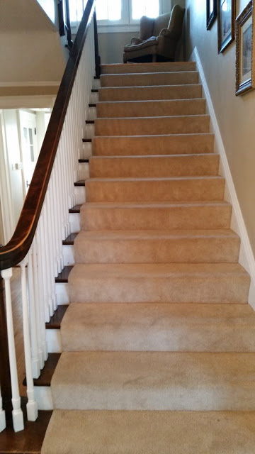
Stairway Before:
And after:
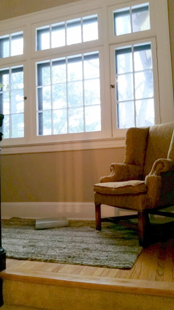
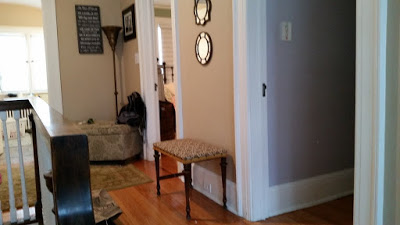
The landing before:
After:
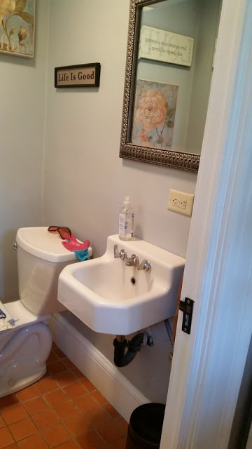
The back bathroom before:
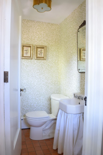
And after:
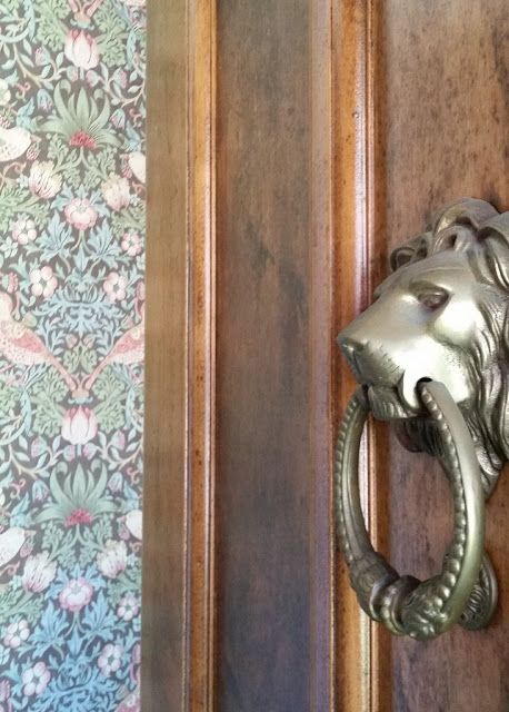
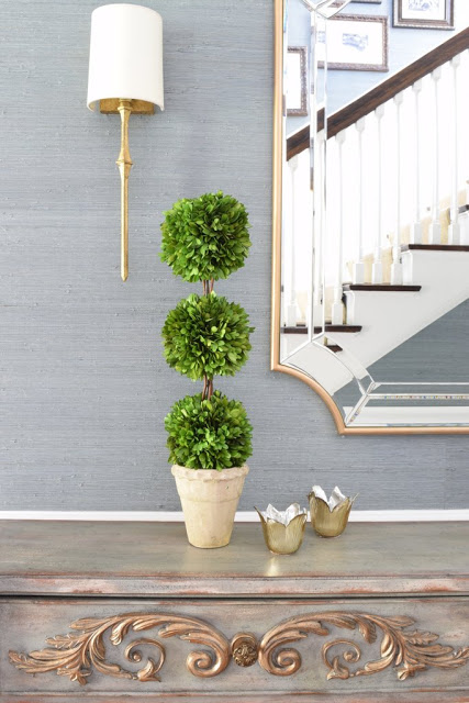
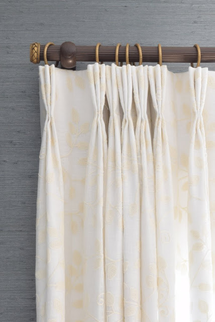
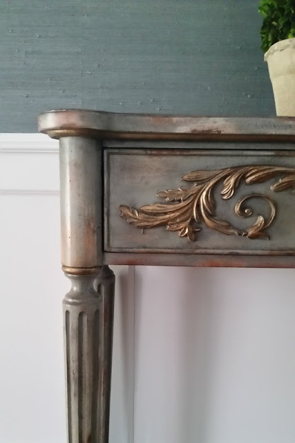
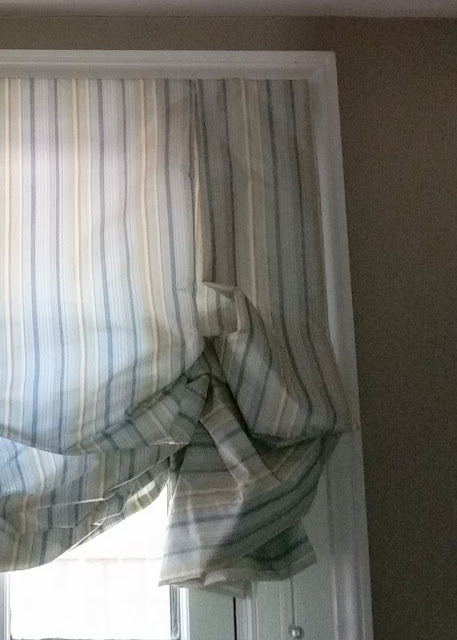
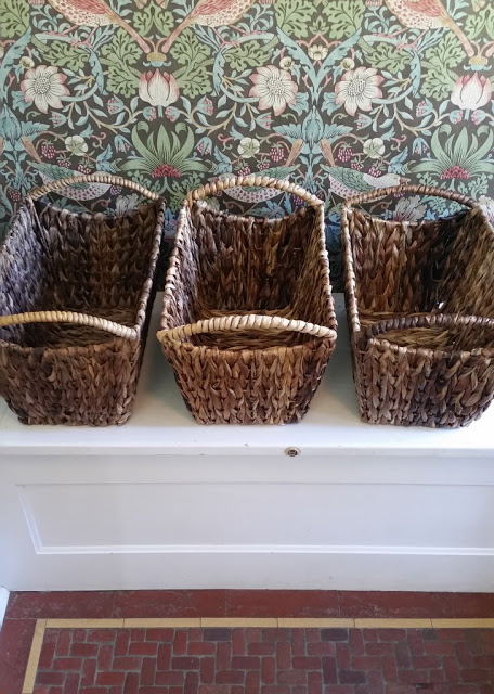
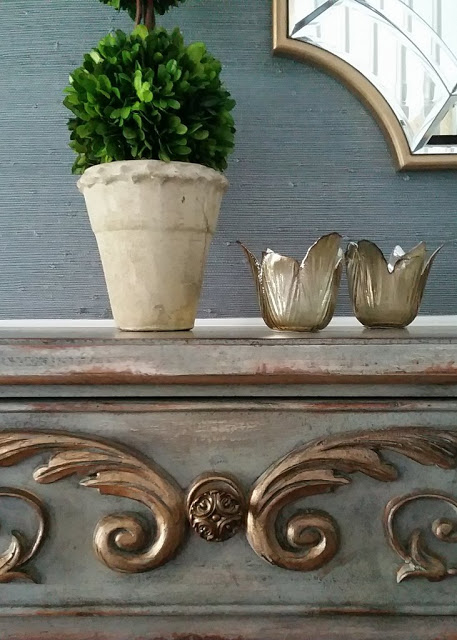
A few more details:
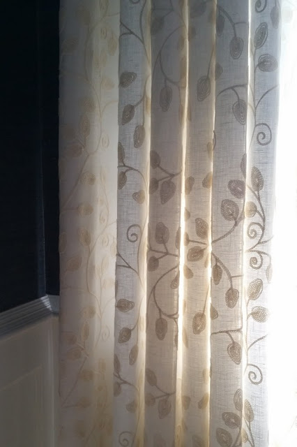
(love the mix of a reeded wood pole to connect to dark wood banister, with gold end cap and rings to tie in with the new gold lighting. Also, The embroidered vine-patterned fabric was really hard to capture!)
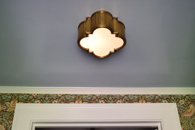
I always love a reason to paint a ceiling!
Next up: the sunroom! Think patterned cement tile and built in banquette. Hopefully this summer.

