Before and After: Classic Meets Cozy
We are excited to finally share these before and after photos of this renovation and addition project in South Minneapolis. The project was actually (mostly) completed in March 2020, but we all know what happened then. As the pandemic waned in early 2022 we were able to photograph the work. I love that it feels as if we could have completed it just this minute—as fresh as ever.
Exterior
Architect Andy Campbell of ACDC Studio simplified the trim on the exterior of this charming Tudor. We lightened and brightened the aesthetic with a whiter, smoother stucco and blue-grey trim.
After photo: Scott Amundson
The Kitchen
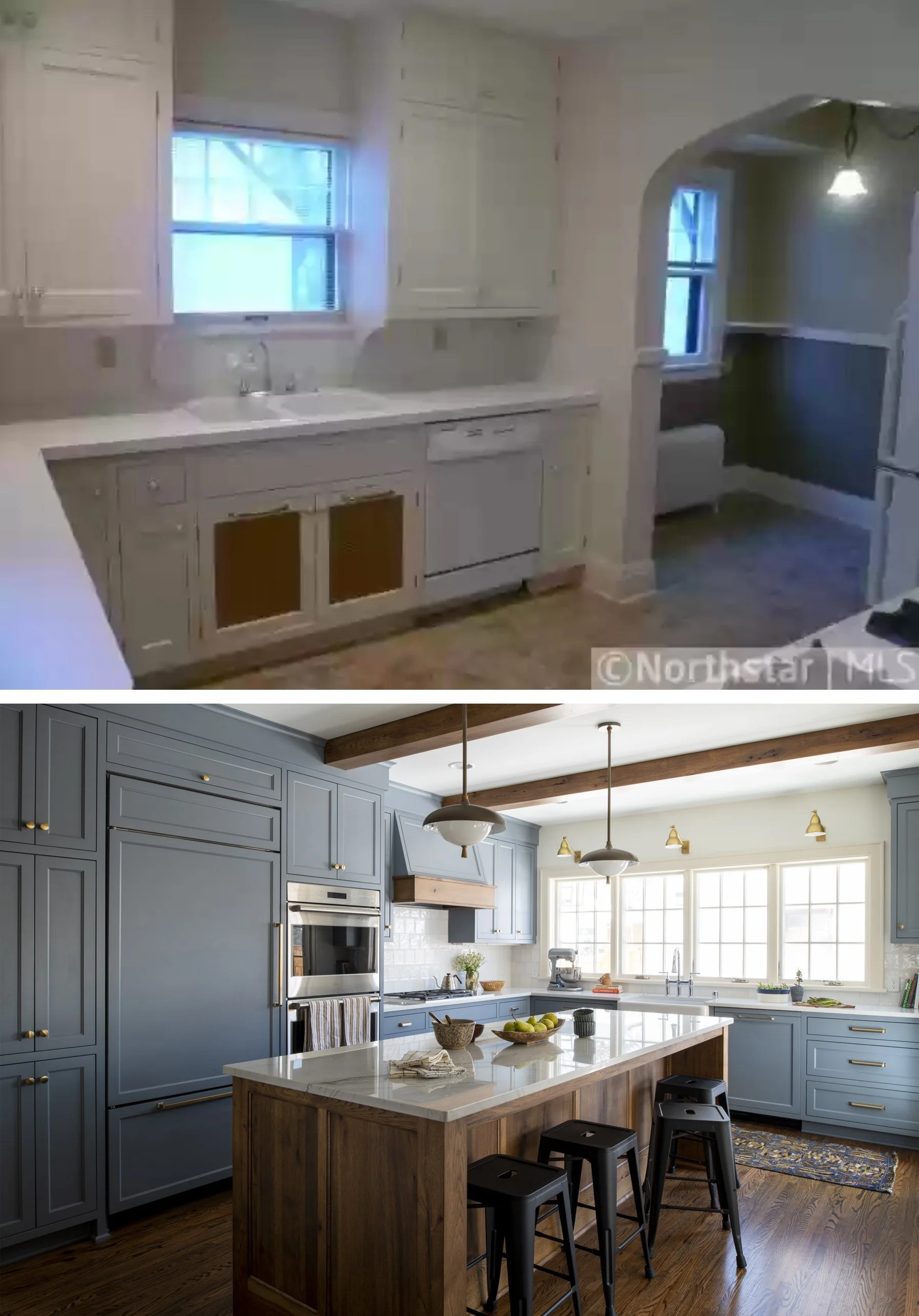
The original kitchen was tiny! The photos below are the same angle and have the same window placement, but the wall at right in the “before” photo was pushed out about 15 feet to create a much larger kitchen. A narrow mudroom was carved out at the side.
After photo: Scott Amundson
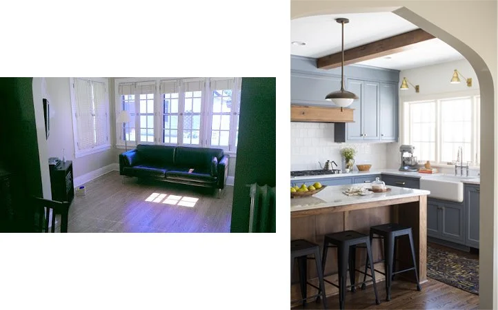
While these two photos are taken from different angles, you can see how much was gained in building out the kitchen. A large island, big windows overlooking the yard, more storage, and better appliances all add up to one major upgrade.
After photo: Scott Amundson
The kitchen now adjoins the existing sunroom, which used to jut off the back off the house. The window at left was expanded to be a new arch connecting the two spaces. The arch was designed to match the originals in the house.
Where the refrigerator and built in cabinet were before, we added a dine-in booth, perfect for breakfast and homework. It adjoins the dining room through an expanded archway (previously there was a swing door.)
The Dining Room
The dining room now has arches on three sides and windows on the fourth. To make it feel like a destination, we used a warm, glowy chartreuse on the walls, simplified the light fixture in a tonal gold, and filled in the furniture!
This is the view from the kitchen by the dining nook. With a singular statement like the wall and drapes combo, everything else is tonally pulled back. The interest comes in the mix of shapes and finishes.
The Living Room
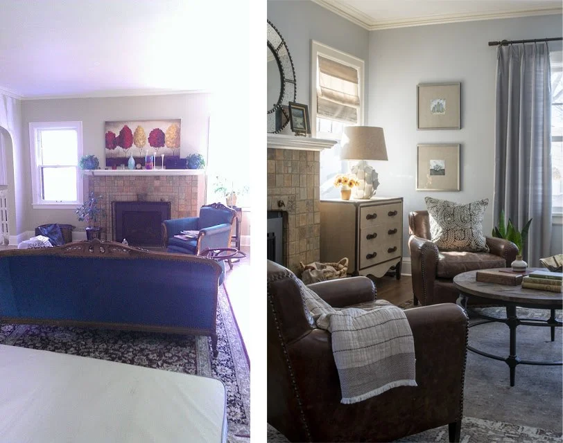
The living room upgrade was completed in the first phase back in 2014. Our clients had a mix of hand-me-down furniture and low-cost pieces from their student days and small apartments in bigger cities. We love how the design has held up, and took our cues from the masculine, textural mix when specifying materials for the renovation!
After photo: Scott Amundson
While we also added a primary bathroom and renovated a hall bath, there are no before photos! Head over to Featured Projects page, here, to see the full portfolio of images on this project.
It was a joy to work with these clients over so many years, and we just love the results!


