Before and After: Pond View Dr - Phase I
We were thrilled to see my brother’s house in the current issue of MSP Home and Design — click here to read the full article.
In the meantime, it’s always fun to see the before and afters. We pulled together some same-angle shots and compared with the real estate listing photos to give you a sense of the transformation.
You can also see the full project portfolio on the website here.
Living Room
Throughout the house, we removed the crown molding and changed the trim and doors from golden oak in a fussy, country profile to simpler shapes, painted white.
We removed the living room carpet and entry and dining room tile and replaced it with red oak in a dark stain, which is continuous throughout the main floor living spaces.
The living room also got a boost from removing the built-ins and rethinking the fireplace. We built a column into the room, upsized the gas insert, and created a recessed niche for the television. To keep the TV from commanding too much attention, we used a charcoal wallpaper with a feathered texture from AJ Maison.
For a bit of glamour, we designed custom couched with Patricia Edwards with a vertical channel back.
Dining room — Kitchen
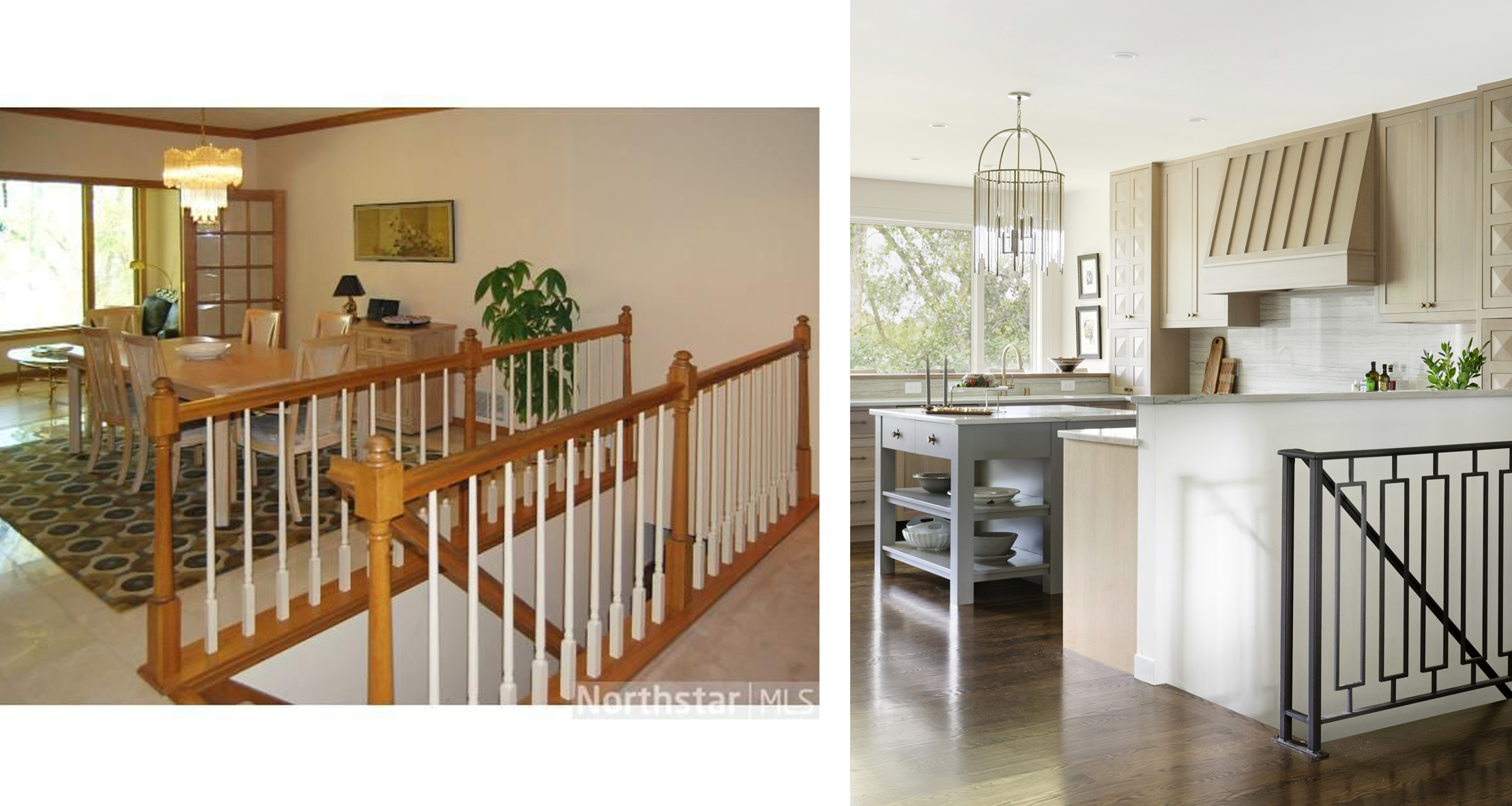
The biggest change was moving the kitchen. It had been closed off from the living spaces, but moving it to the former dining room allowed it to relate to both the living room and the dining area.
Moving the stairs was a non-starter, so instead we simplified by adding a pony wall on one side as the boundary of the new kitchen. On the other side, we created a custom iron railing to me a quiet statement.
We also took out some walls and doors, to connect the two large windows at the back of the house. Now the family enjoys a panoramic view of the pond, and the full view is visible from the front door. The fridge, bar, and pantry wall is out of the work zone, so anyone can grab a snack or drink without disturbing the cook. To compensate, we created a work triangle with refrigerator doors in the island, where they can keep ingredients on hand for dinners.
Dining Room
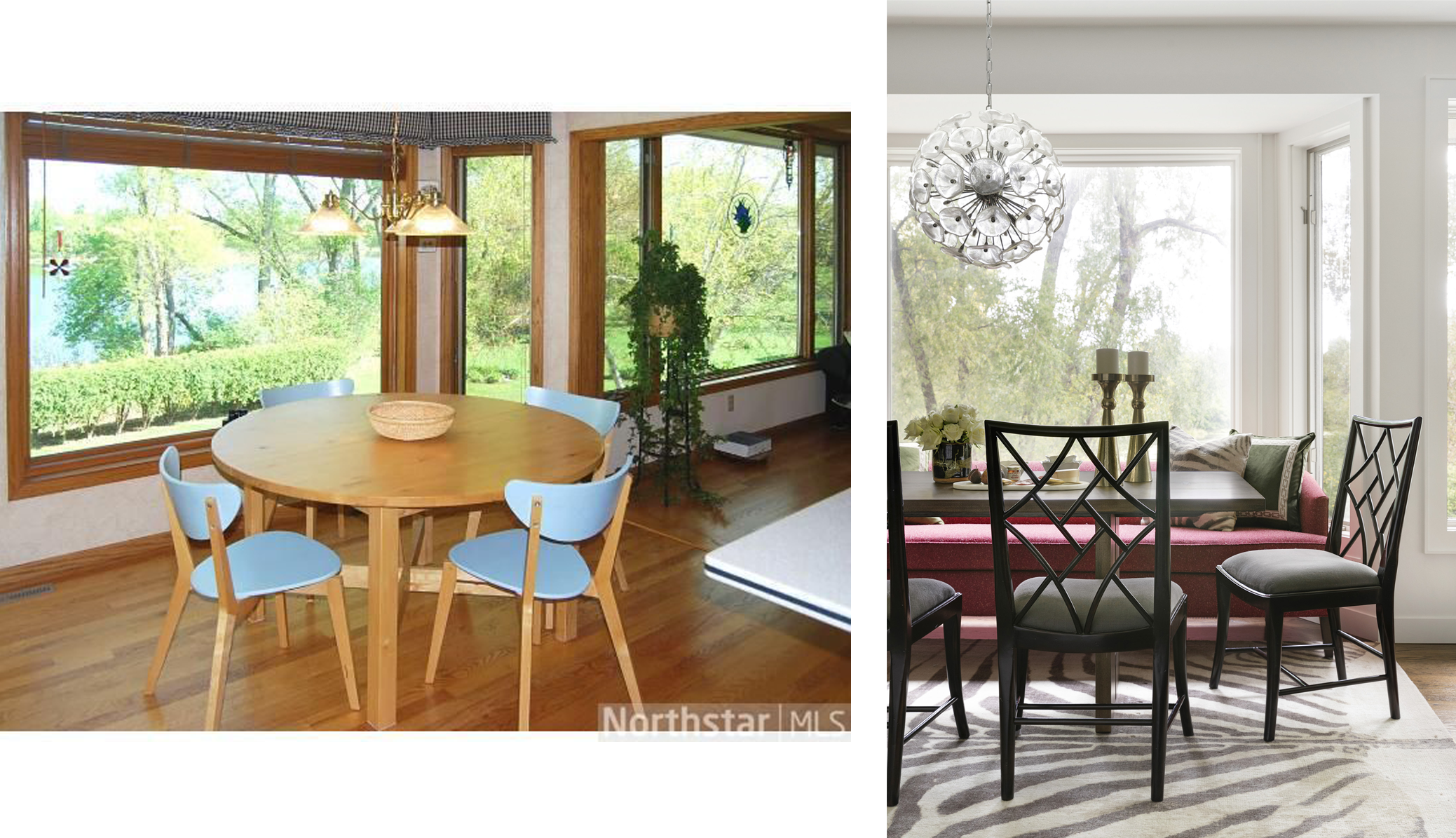
The former breakfast nook became a full dining room. To make use of the bay window, we tucked in a custom dining couch, which allowed us to push a larger table closer to the window. The zebra rug came from their previous home, and the fretwork chairs, through Tapis Decor, speak to their love of Asian design.
Kitchen — Laundry and mudroom
The former kitchen adjoined the garage. This became a logical place for the combined mudroom and laundry room. (For reference, on the other side of the washer dryer wall is the pantry wall shown above.) Because it opens to the dining room, we created a custom barn door in a fretwork design, so laundry and mudroom mess can be easily shut away during meals and parties. The floor in here is tile with a grasscloth look, and the other side of the room has a wall of custom built ins.
On Friday we will share before and afters from the second round of renovations: the bedrooms and bathrooms. Pretty major transformation so far, right?


