Tricks of the Trade: The TV
Let’s face it: designing around a giant TV is one of the design dilemmas of our age. While they have gotten sleeker and thinner, they have also gotten much, much bigger! So, what’s a design-minded person to do?
Hide it
In this traditional living room in Minneapolis, we tucked the TV inside an antique french armoire. Yes, seriously—it’s in there!
Photo: Spacecrafting
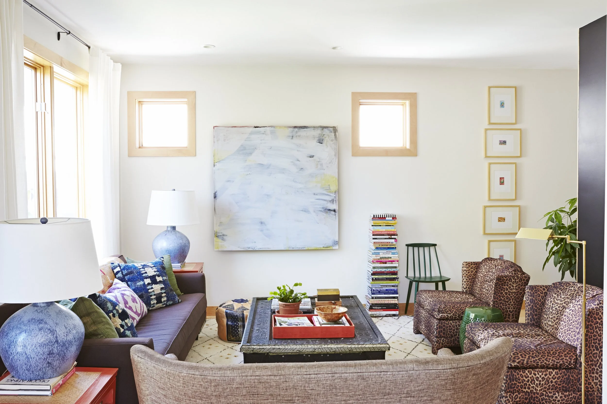
In my living room, I made a large canvas to hang over the TV when not in use. Not lying—it’s under there!
Photo: Kim Cornelison
Disguise It
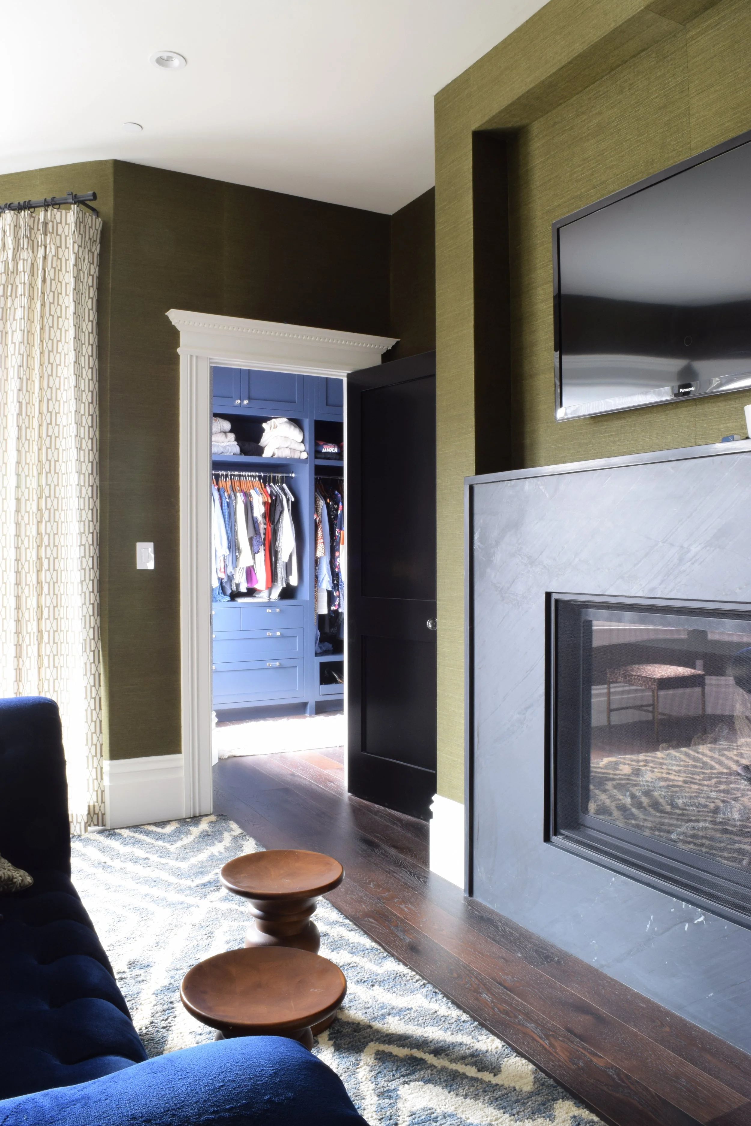
Honestly, most people don’t want to go to the trouble of covering and uncovering the TV. (And if I’m being honest, I abandoned the painting long ago when I realized we watch TV more than just occasionally!). In my brother’s living room, we built a niche above the fireplace and used a black wallpaper to ensure the TV did not stand out like a big black box.
To solve the height issue of the TV over the fireplace strategy, this one is on a bracket that pulls out and down, putting the TV closer to eye level.
photo: Spacecrafting
In a primary bedroom in San Francisco we employed the same strategy. Here we made the niche larger for more flexibility in size of any future TV. Brining the niche down to the fireplace also gave us a little more of a mantel shelf.
Surround it
In a family room in St. Paul, we incorporated the TV into a gallery wall full of the kids art and sentimental pieces. When the TV is off, there is still so much to look at!
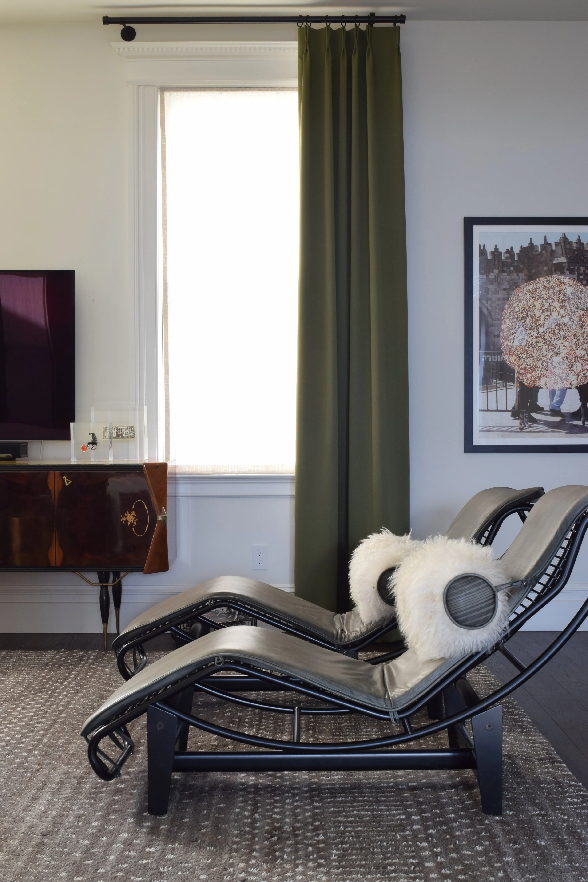
In a family room in San Francisco, we surrounded the TV with gorgeous draperies and a beautiful vintage Italian sideboard. Freestanding art adds to the interest and offers something to think about other than the black box!
Balance it
In a living room in Prior Lake, the architects solved the old dual-focal point challenge by offsetting the TV and fireplace. The addition of shiplap on the TV wall helps ground it. though the shiplap is white, the TV feels less like it is floating in a large blank space.
Photo: Spacecrafting
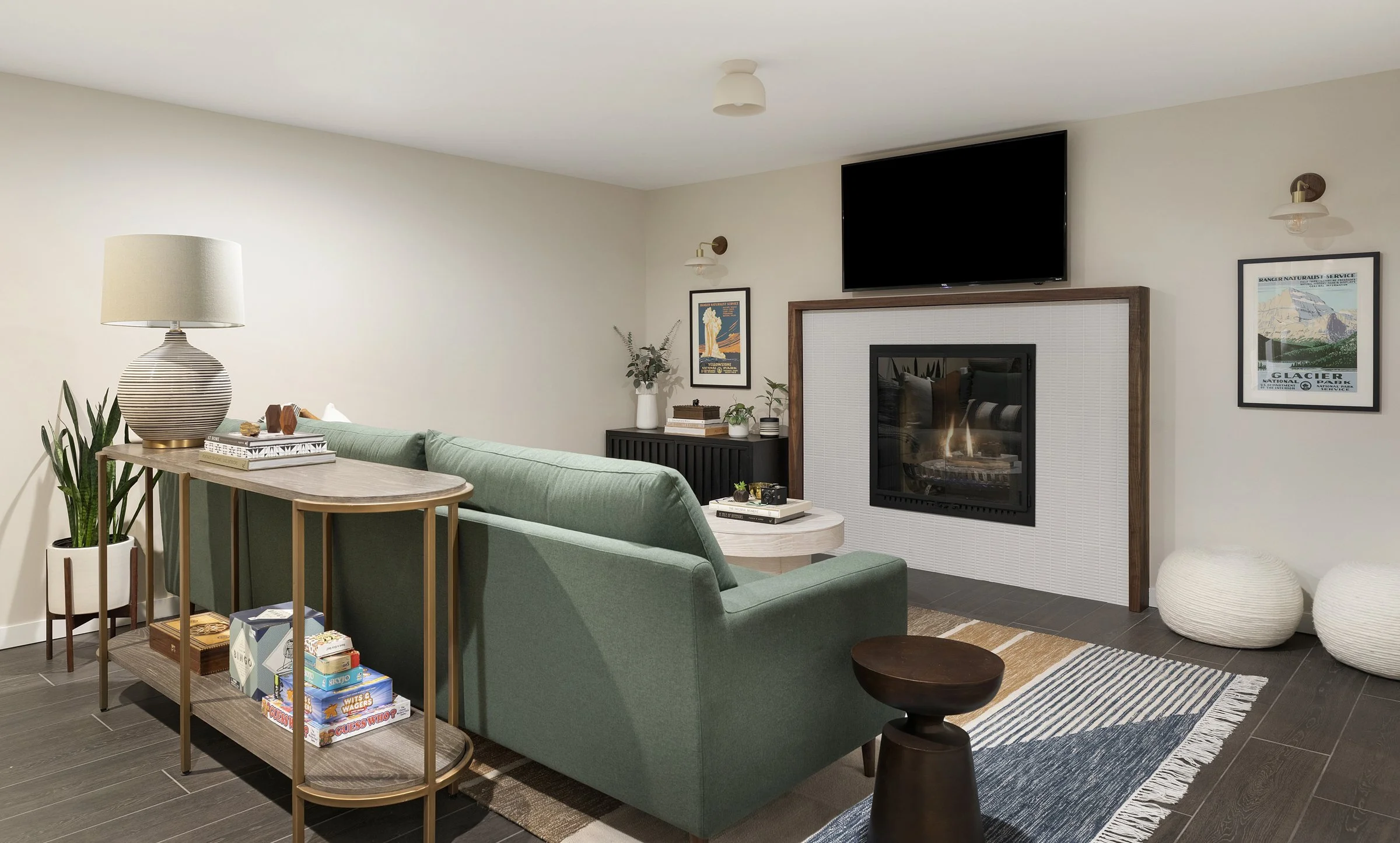
In a basement family room in Edina, we used sconces and art flanking the fireplace to create symmetry on the TV wall as a whole. Adding a second console where the poufs are would have taken the symmetry one step further—but in this case the client favored additional flex seating for kids.
Photo: Spacecrafting
Fake it
If all else fails, go for the Samsung frame TV! We have one in the studio and chose “Artwork” that blends with out color scheme and the real art throughout our space. We also styled the console below as a console, not a “media cabinet.” with a lamp, books, and accessories. All of those details pull focus away from the TV.


