Eleri's room process and mistakes
Yesterday I shared the before and after in the guest room-turned 7 year old's room. I also mentioned that this room continued to feel unresolved to me. Why? Well, I rushed. I didn't stick to a master plan. And then I made incremental changes to over-correct, and that kept making things worse instead of better.
Here's some of the phases and what we can all learn from them!
1. The day of the surprise.
We decided to surprise the girls with makeovers when they spent a week with their grandparents. I had this plan for Eleri's room, inspired by the pastel suzani euro shams, found on sale at Pottery Barn.
Some of the furniture plans changed, and the linen scheme felt a bit grown up--I would have been happy with it in my own room! Also the sheepskin-over-the jute rug didn't work as both pieces are old and it just looked dirty. The result on the day of the surprise was okay, just a bit unfinished.
Then, my bedding gave out and I decided to put the hotel bedding in my room and get new bedding in here. I found this reversible duvet from the Shabby Chic line at Target and loved the floral--Eleri draws flowers all the time. Flowers are her favorite.
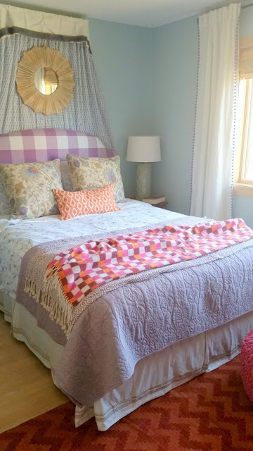
Right about then, we had the conversation about layers. This is also the child who has always wanted "bed curtains." I remembered some block printed curtains I picked up to use as a shower curtain in their bathroom. Here's another problem, though: the blue in the new bedding and curtains is very different than the wall color. More porcelein blue versus slightly aqua. And whoever says all blues go together has not been in this room! I would sit in here at night reading Harry Potter, just cursing the wall color. This is 100% my fault: Eleri chose something lighter and wispier, "like the sky," but going from Navy I was afraid to go SO light. She was right, I was wrong!
You can also see here how I started swinging to the Loud! Bright! Crazy! end of the spectrum. I can tell you that the effortless bohemian layered mix of patterns things is not an easy look to pull off.
Whoa. WAY too many dominant colors going on here. (Also a lesson in experimenting when the children aren't home. As soon as I brought that pouf up from the basement, Eleri did not want it to leave!)
Then I added the butterflies. The swing chair had to go where it is in order to screw into a ceiling joist. The placement is awkward and the wall needed to be filled with art--but I wanted her to be able to USE the chair, so I couldn't hang anything that was going to get knocked and broken. At the same time, I really wanted to cover the blue wall color, which, as mentioned, I hate.
The butterflies were going to fill that corner with the chair, only, but either I mis-ordered or the vendor sent me extra. I had HUNDREDS of butterflies, folks.
And it was just WAY too much with the bedding and the rug.
Finally, I just had to walk away for a while. I knew there were too many tensions at work:
- Dirty colors and fresh/clean colors
- strong color AND strong pattern
- too many 2-tone elements
And that ultimately I kept switching gears between soft and dreamy and bright and cheerful. I had to make some decisions.
So I stole the rug from Clio's room, which has both clean and dirty colors and a beautiful dose of texture, returned to the hotel bedding, and reduced the amount of color and pattern over all. I swapped the bright pouf for a soft one and the painted green desk chair for the clean white Ghost chair.
I also kept most of the pattern to a simple palette: the butterflies, dresser, headboard, and reversible quilt (totally stolen from a room I designed at my parents house while they are out of town!) are all two shades of purple. There is still plenty going on here, but it is much calmer now overall, with more concentrated areas of bright and fun.
Of course, I still want to repaint the walls.....


