Before and After: Queen Avenue South
I've been shooting some of last year's projects for my portfolio and a website update, and I'm excited to share these projects here! If you follow me on instagram (you should! @hpetersondesign), you have seen peeks of this project, both when it was installed and last week during the shoot. But I think the full reveal before and after is pretty fun!
This is just the nicest family. They moved from a small apartment in a bigger city to a much larger tudor home here in Minneapolis. As is so often the case when we upsize, their home was full of hand me downs and small scale furniture. Nothing was their taste and nothing really worked.
They wanted a moody palette and masculine vibe, with some hits of color to bring a cheerful edge.
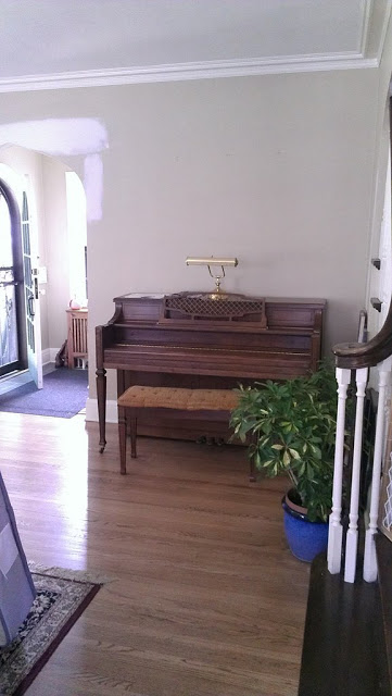
before:
Before:
Living room before:
This is just the nicest family. They moved from a small apartment in a bigger city to a much larger tudor home here in Minneapolis. As is so often the case when we upsize, their home was full of hand me downs and small scale furniture. Nothing was their taste and nothing really worked.
They wanted a moody palette and masculine vibe, with some hits of color to bring a cheerful edge.
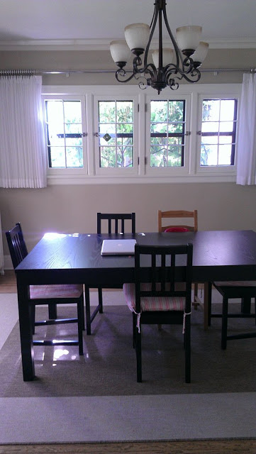
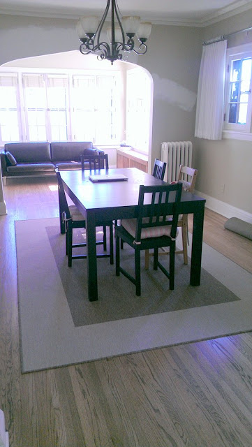
The dining room. Before:
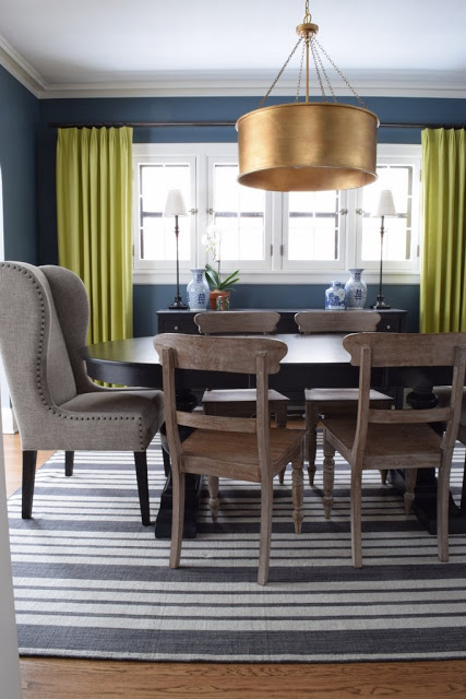
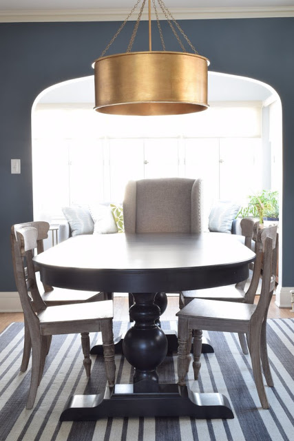
And after:
before:
And after:
The client picked this deep blue with a touch of green and gray, and I love the impact. The room is on the dark side, and going dark on the walls kept a cool, moody vibe.
Before:
And after:
We also played with scale a lot, and I love the contrast of the tall head chairs with the small side chairs. The oversize gold drum shade makes it work.
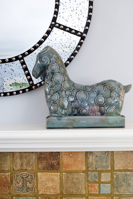
A detail:
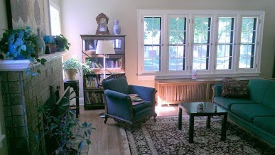
Living room before:
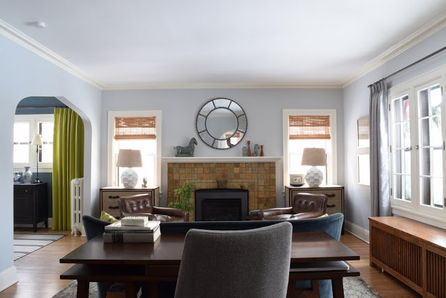
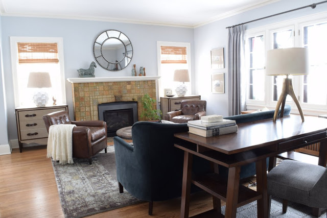
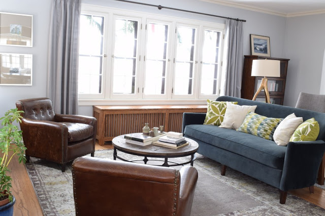
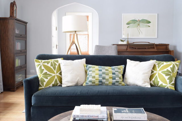
And after:
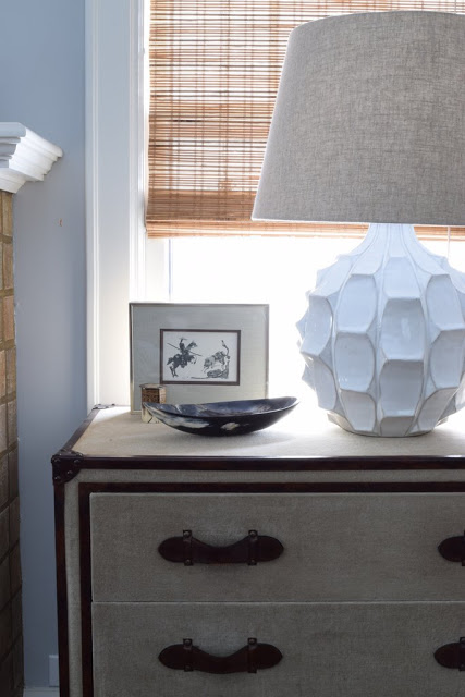
We kept the basic layout of the couch facing the lovely fireplace, but we really hit on the symmetry with a pair of chests flanking it, topped with overscale ceramic lamps. We also did a pair of chairs, and added function by floating a desk behind the couch.
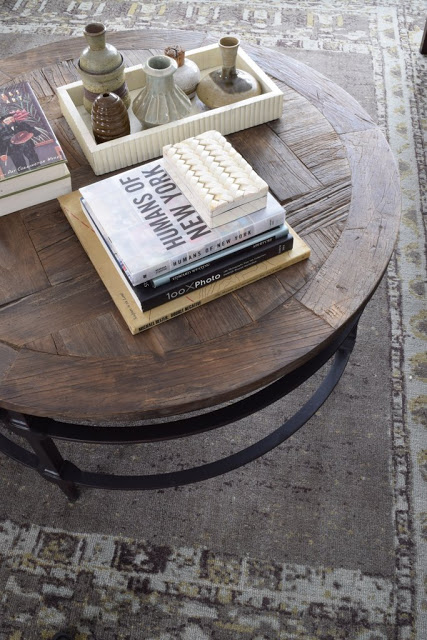
So much of the interest in this project came from texture, like the reclaimed wood and iron coffee table and the mix of linen and leather on the chests.
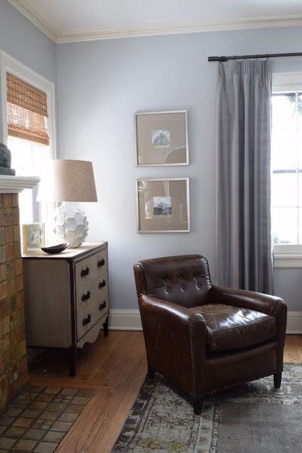
Before:
After:
Silk curtains in a grey similar to the walls adds softness without contrast and highlights the beautiful window.
Before:
Before:
After:
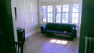
The sunroom before:
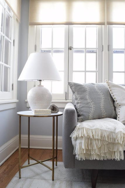
The sunroom was probably the most neglected, with an ikea couch and a small media stand. The single shutters on each window also chopped up the space, and because they had a tall stack, they blocked the light.
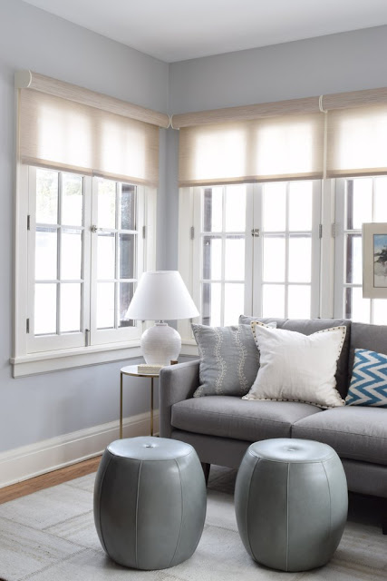
Sunroom, after:
Now, the roller shades are a much simpler treatment on the windows (and they do retract completely). A slim sectional and pair of leather poufs are great for TV watching. I'm a huge fan of the patchwork hemp kilim rug--custom made for us in Turkey.
This is one of my favorite projects. (My only regret is that we did not have the dining room radiators painted the wall color--but that could always happen at a later date, if desired.) These rooms look very different than if it was my own house, but I love every piece and I am totally thrilled with the transformation! I suppose that's how it should be with a good design collaboration with a client.

