The first office
Well, if you
(you should!) then this is probably a pretty anti-climactic before and after, but alas.
I first leased this space in January, when the puppy made it impossible to go on working form home. I had looked on and off at small spaces in Minneapolis, but this one was just right: near my kids' school in a smallish and well maintained office building with a "shell" brimming with potential.
The before:
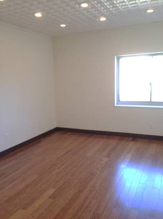
And the after!

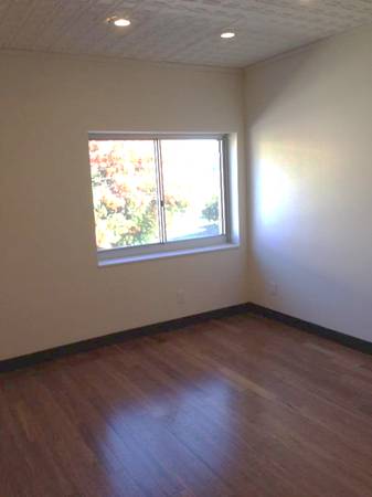
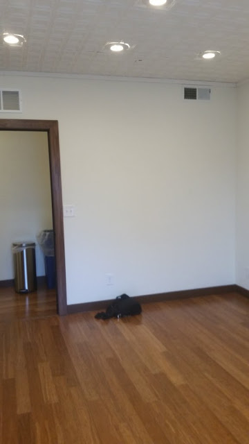
This space has good bones: natural light, wood floors, and a very pretty pressed tin ceiling, which does a lot of work adding some charm and character to what really is a white box. I also love that the paint color is warm and creamy, not a bright stark white. (Nice job, landlords!)
The downside was how the single window sat way off in the corner and was kind of small for the wall.

Window treatments to the rescue! I hung ready-made curtain panels from my
(fully lined, weighted hem, and tab backs, which make for the best non-custom panels), going to the longest standard size that would fit (96"). Then I put a natural bamboo shade at the height of the curtain rod to cover the gap from the top of the window and trick the eye to thinking the glass extends up behind the shade. I also extended the rod on the left to take up more of the wall. (btw, the rod was $6 from ikea)
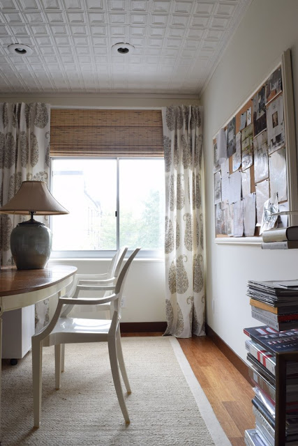
The left panel ended up being centered on the table/desk, which gave pleasing balance where there was none naturally.
That table was a craigslist find for $100. I loved the large surface (it has leaves for flexibility) and I always think pieces that have pretty details make a huge impact in a small space. To make it function as a desk, I picked up a $60 file cabinet with drawers from Ikea that tucks underneath.

On the other side of the room, by the door, I created some storage with bins for samples on each current project and topped it with a mirror to bounce the light form the window around the room.
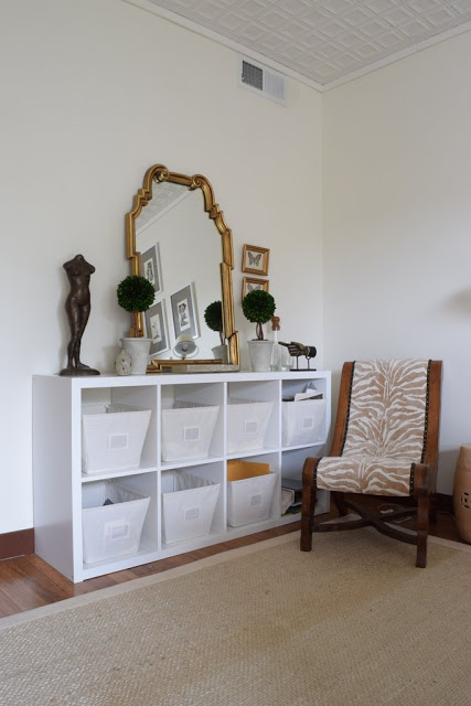
The chair, a south african photographer's sitting chair also purchased off craigslist and recovered in a Kravet zebra print with espresso gimp and black-brass nailhead, was mostly just pretty, but also provided a spot for a kid to perch when dragged to the office after school.

(Fun fact: I sometimes style finished spaces for the shoot and occasionally the client doesn't want the props I bring in. Check out
and you will find the topiaries and that awesome mid-century statue! So glad I got to keep it. The little silver tray in front of the mirror is also left over form that shoot. IT serves as a drop spot for keys.)
I HAD to add a lamp, for function of course, and luckily found this awesome scissor one on final closeout at RH. Again, in a small space it's great if your functional items can also serve as visual interest. This guy is practically a sculpture.

Finally, It's no secret that I am a BIG believer in the power of an art wall. This space needed something big to ground the whole desk area, but I didn't want to spend a ton. I found a book of world myths for about a dollar at the retrowanderlust warehouse sale, with 18 book plates representing myths from different countries. I bought up a load of my favorite white frames from Target and had my framer cut custom mats in this awesome army-olivey green. (I would have just used the white mats that came with the frames, but the opening was too big for the prints. Since I had to go custom anyway, it was an opportunity to make it LOOK custom and bring another tone to my fairly neutral space.) Fun fact: I hung this grid the day I moved out, for this shoot. (with contact strips--no wall damage!) There is a larger grid of these in the new office space.
In short, some ways to dress a white box and make an office beautiful AND functional:
- Make a small window bigger through the magic of window treatments
- Use furniture from outside the "office" category to create a personal feel
- Use strategically placed frames to create architecture
- Let your lighting serve as sculpture
- Storage can be attractive
And yes, I did buy a white computer to go with the color scheme.
A little more background, since apparently I have MUCH to say about this little space:
I wrote about the coolie shade on the lamp
.
I wrote about the problem of starting with a colorful rug
And I shared a design plan
. (I ended up not too far from this!)
The new space, which is larger and has the bonus of storage, is coming along. I shared the design board
