Before and After: York Ave Condo

Oh, this was a fun one.
The clients decided to downsize from their long-term family home to a "retirement condo" well before they actually retire. The style of the building--a sort of 60s modernist box--was VERY different from their 1920s tudor house, and they decided to change out most of the furnishings. They did, however, bring their art and collections--the IDEAL situation, if you ask me. This way there is tons of personality to get you started, but also the freedom to choose just the right type and scale of furnishings for the new space.
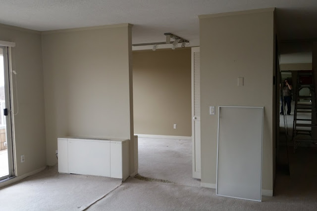
The apartment hadn't been touched, and sported wall to wall carpeting, walls of sheet mirror, a mix of louvered or slab doors and really dinky trim. The real selling point of the 6th floor apartment was all the light from the large glass doors and windows. The weird soffit and shelf on the long wall in the living room? Not so great.

(Beware: cell phone pick below. I realized as we were leaving the shoot that this was a shot I needed!)

Dark wood engineered floors, new french doors, and amped up trim made a huge difference!

To orient you a bit, here is the floor plan for the open living area:

The kitchen is off the entry, a breakfast room opens onto the dining room, the den is off the living room, and the bedrooms and bathrooms are off the doorway to the left.
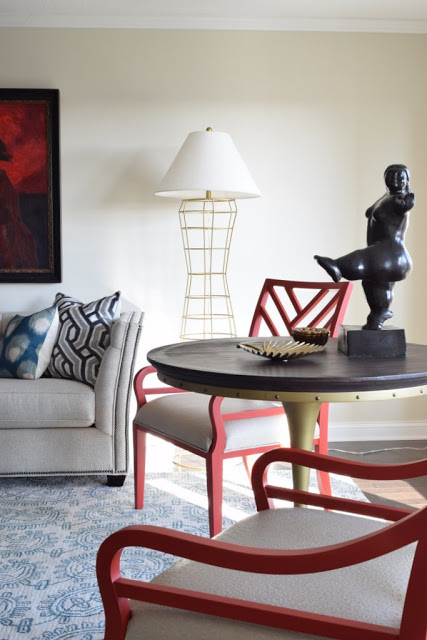
The clients managed the construction, but I got to specify materials for the shell. This made for quite a fun collaboration. In the decor, we landed on red and teal as a predominant color scheme and brought in both deco and industrial touches, like the deco patterns in the rug and large pillows and the rivet detail on the side table.
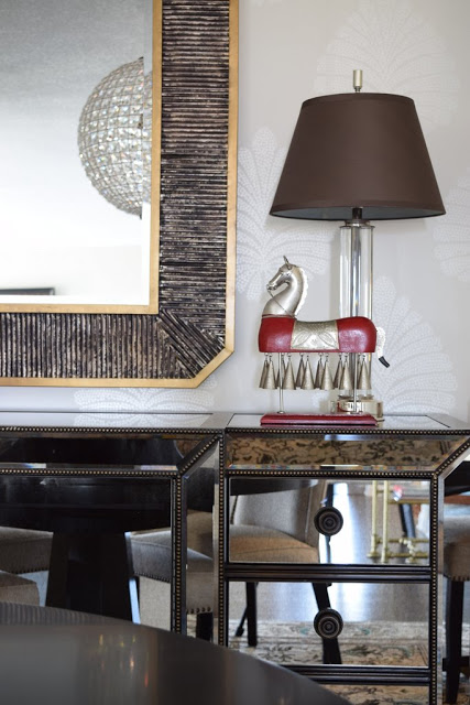
The dining room is off the living room but sandwiched between the den and breakfast nook, and gets no natural light.

I knew that removing the sheet of mirror would lose light, so we subbed in reflective materials that were more attractive (and less dated!): a mirrored buffet topped with a tall mirror to double the light from the crystal chandelier, glass column lamps, and wallpaper with a pattern made from glass beads. While it is not a sper bright space, it is glimmery and sparkly and moody--just right for dinner parties. The rug and lamps came from the dining room in their previous home.

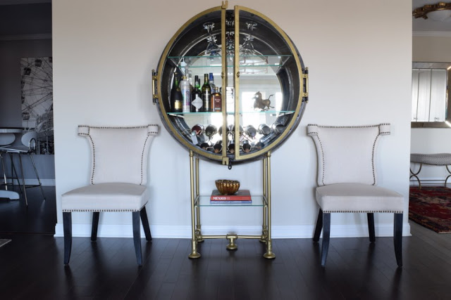
The clients found this very cool bar with industrial details at RH, and the extra dining chairs fill out this wall nicely. (You can see a hint of the breakfast room on the left and entry on the right). The back of the cabinet is also mirrored. Since it faces the french doors, it provides additional light during the day.
In the bedroom, they originally thought they would put the bed on the long wall.

I was super surprised when they went for this layout, which allows a progression from the more public to more private uses of the room: The desk at the entry for home office, then this seating area (the chairs face an armoire with a TV), then the bed.
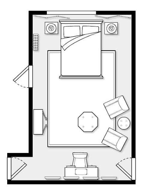
The chairs and rug were in their previous living room--moving pieces from one type of space to another can make them feel new.
Despite the strong color and mix of patterns, the bedroom feels like a serene hotel suite.

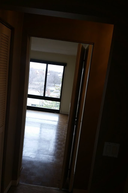
(Cell phone pic from the hallway!)

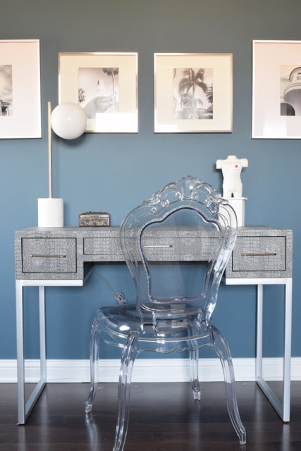
The home office area, with personal photos from their travels over the desk.
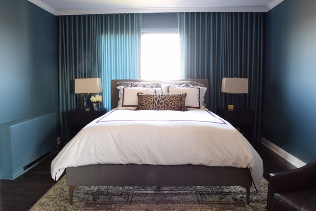
The challenge with siting the bed on the far wall came in the form of a way-off centered window.
Window treatments to the rescue! We did a wall of ripplefold drapery, mounted behind the crown molding and in a color that matches the walls. Closing them as far as the left edge of the window gives a sense of balance, and when all the way closed it's like a complete fourth wall.

When their grown son officially moved out, we turned the second bedroom into a guest space.

The gabbeh rug, pine cabinet, and vintage eames lounger were existing, not to mention the very cool mask collection. We brought in a daybed (in teal--with red, it's the throughline color for the apartment) and sculptural pieces like the tripod floor lamp and african-inspired stool.


In the hall bath, my main contribution was the zebra-print wallpaper, which ALMOST didn't go (the husband wondered if it was too feminine), but the addition of the Avedon print of a man shaving tipped the balance.

I always like it when an entry announced the major elements of the whole space, and therefore do them last.

The husband was a rugs dealer when he met his wife, and I loved finding the right vintage rug for the entry--while red persians are common, finding one with turquoise (instead of navy) is more challenging. The light fixture gives us the gold that repeats through the space, and a hint of deco, which was also a theme. We took a cute little bench from Wisteria and recovered the plan canvas cushion in a graphic print from Schumacher. The mirror they originally selected for the hall bath. A single flat panel on the bifold doors and crystal knobs dress up the wall of closet.

Kitchen before--view from the entry

The kitchen was basically a cosmetic gut job, and led by the clients. I suggested the material mix--white cabinets, soapstone countertop for drama and contrast, plus glass backsplash and crystal knobs.

Den before
Peeks into the den, after:


The furniture was all existing. I recommended a moroccan rug and the client found this one. With this type of layout--an open plan living area and separate private rooms--I like using a light neutral in the large space and deep, cozy colors in the private spaces. The den and guest room are the same velvety, minky grey-brown.
Finally, I love when I get to do accessories and styling. By the time we get to that layer, I tend to really know my client's taste and love picking things out for them! The coffee table is a mix of things they had and items I sourced--but you would never know which is which!

Okay, I'm done. Perhaps this should have been multiple posts?
Hope you all have a wonderful week (and not too harried) preparing for the holiday break.
