Before and After: Elmwood Place
I finally photographed one of my favorite projects, and I'm really excited to share with you!
The client is just the loveliest family, and we have been working together now in various capacities for about 4 years. I shared the transformation of their entry, hall, stairwell, and powder bath
.
This was one of those cases where they moved into a much larger home that needed work and started tackling the big projects. Before I got involved, they renovated the kitchen, lower level family room, and library. As a result of the time, energy, and money spent there, other spaces were a bit of a mishmash of pieces from their former home, hand me downs, and things picked up on the cheap. Two of the most usable spaces in their home, the main living room and a charming sunroom, were totally under utilized.
I'll show you the living room here and the sunroom in another post! I shared sketches for the living room a million years ago--
.
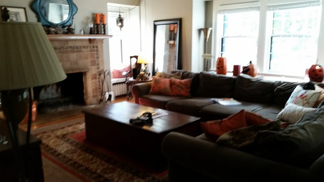
Before: Looking in to the living room from the front hall:

When we worked on the entry, we added millwork that feels original to the house, added a slate blue grasscloth, and upgraded the stair runner. In the living room, we lightened the palette, scaled the furniture more appropriately to the room, and added polish.
After:

Before: After considering a number of possibilities, we ended up keeping the same L-shaped seating for the floor plan, but with two different couches and a pair of chairs to flank the beautiful original fireplace.


After: By using two couches instead of a sectional, we were able to push the layout back into the window niche, making the room feel bigger. We also ended up with much more seating--now everyone in their family of six has their "place" in the room.

Before:
There was a family workstation in the front corner, but it was bulky.
We designed built ins for around that window (and to cover the radiator).

After:
The built-ins feel original to the house and provide a more streamlined office station (the drawers on the right are file drawers.)

We lined the backs of the shelves with a paper that feels like venetian bookend paper and added antique books and lovely objects. We also added sound throughout the main floor and used compact bookshelf speakers. You don't always have to hide your electronic components.

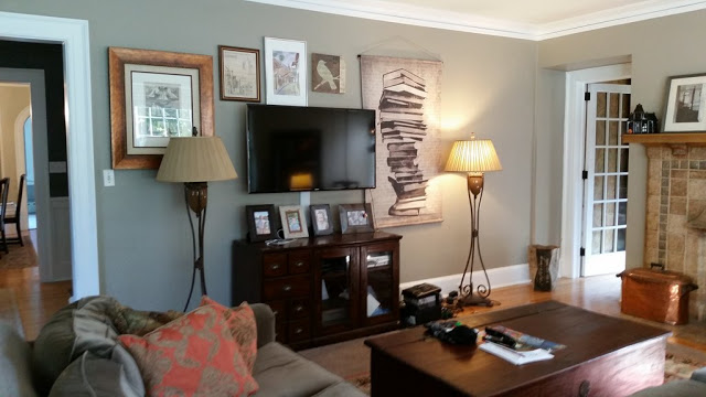
Before: The long wall of the room was the only place for the TV.

After:
We hid the TV in a gorgeous armoire--a french antique from the 1800s. The scale of the piece really balances the scale of the room and stands up to the large feature on each wall (fireplace, bookshelf, couch in large window.)

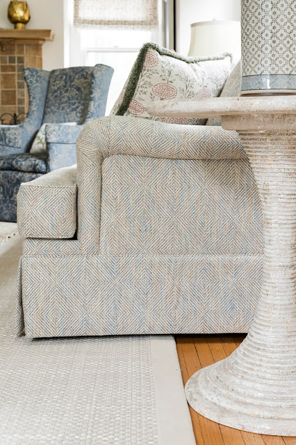
The thing I love most about this room is how many different textures we were able to incorporate for lots of interest and patina.

All above "after" photos
©Spacecrafting
I have to say, I LOVE having these gorgeous photos, and having another eye on my work. I do miss having every single detail shot, like when I was shooting with my husband, but it is an excellent exercise in editing.
Stay tuned for the sunroom reveal!
