Before and After: Upton Avenue South

This project was completed last summer (and it feels very summery!). Where does the time go? It was fun to revisit it recently and to finally take some pictures.
When I walked into this charming home for the first time, I thought, they don't need me! The house felt very calm, lovely, and put together. While my job was partly aesthetic, I think the real triumph here is in maximizing the square footage and making the space "live better."
Living room before:

And after:
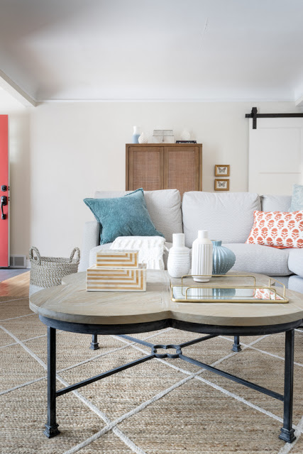
We considered a number of possible layouts, but ultimately decided that what was most needed was more seating, and that more seating in a small footprint meant a sectional.

Before:

To keep a suitable walkway into the space, we had to nix the large armoire. We replaced it with a smaller one and moved it to the entry wall.

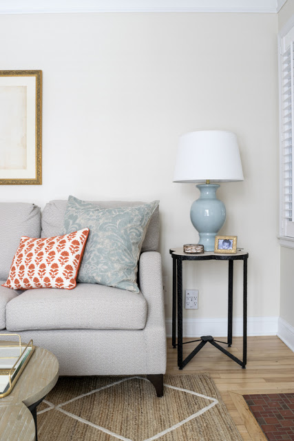
To keep the sectional from feeling too heavy, we chose a lighter neutral fabric, a pretty arm, and a slim, curved leg.

All the tables have a metal base to connect to the barn door hardware and to counter the sweetness of the color palette.
Living room Before:

We kept a chair in the corner to complete the conversation triangle but scaled it up to balance the sectional. Framing the front window with curtain panels helped define the transition from living room to entry.

dining room before:

After:

We repeated the same curtains in the dining room. A small space can feel bigger and more cohesive when a single strong element is repeated. The back of the sectional serves as a "wall" to divide entry/corridor from living room.
Dining room before:

And after

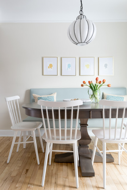
The most significant change was adding a dining bench. The client told me this has totally changed the way they use this space. Now she and her daughter will hang out in here and watch shows together on the ipad. To make it work visually, we moved the chandelier over to be centered on the seating arrangement. An oval table is great when you have a narrow clearance--no corner to hit.

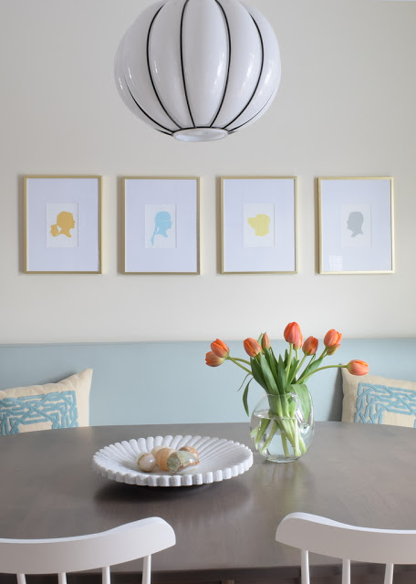
We used some of her existing art (like the large piece over the couch). For the dining bench we wanted a series of pieces instead of one large one. I loved the idea of colorful silhouettes of their family--the vintage charm is perfect for the vibe of this space, and we were able to customize colors to fit the scheme. The kitchen is open to this space, and I love that my client can see something personal when she's cooking.
This project was just two rooms, but there is always a ton of thought that goes in to every project.
One more thing. Whenever I do a photo shoot, I try to buy flowers that match the vibe of the space and feel right for the client. I showed up with these tulips--and my client had just bought the exact same ones!
