Before and After: Curated Meets Drama
We are THRILLED to have this project in San Francisco featured in the Wall Street Journal today. The article is all about me and my friend Sara who gave me a huge opportunity when she tapped me to design the interiors of this extraordinary freestanding Edwardian property in Noe Valley. You can read about it here for background, and today we have before and after photos to show just how major the transformation was.
Because the architecture changed quite a bit, especially on the main floor, some of the paired photos are hard to follow, but I’ll do my best to orient you!
Entry
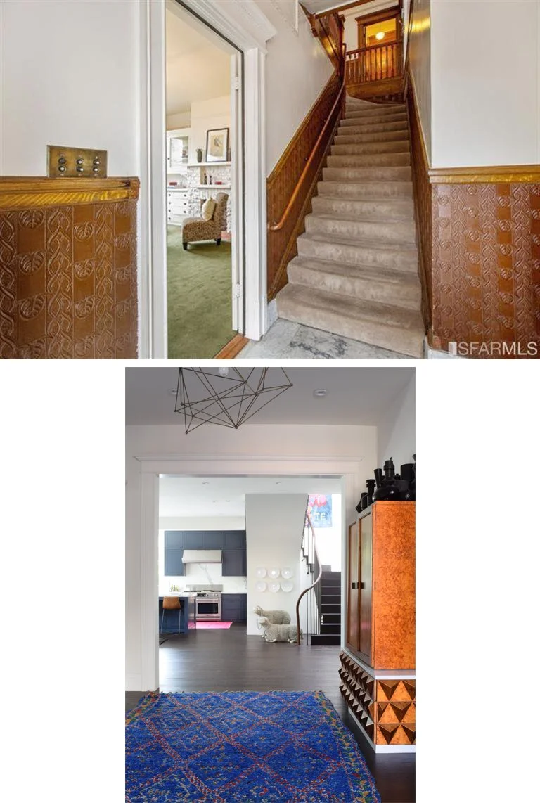
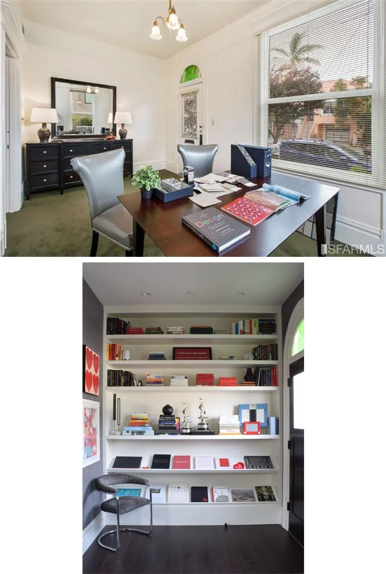
The house originally had a doctor’s office on the main floor, with living quarters above. There are two front doors—one to the office and one that opened directly into the stair hall to go up to the apartment. Architect Antje Paiz of Raumfabrik moved the stairs to the back of the house, making way for a gracious entry. (We did keep the second front door, which now goes in to a home office.)
After photo: David Peterson
Kitchen
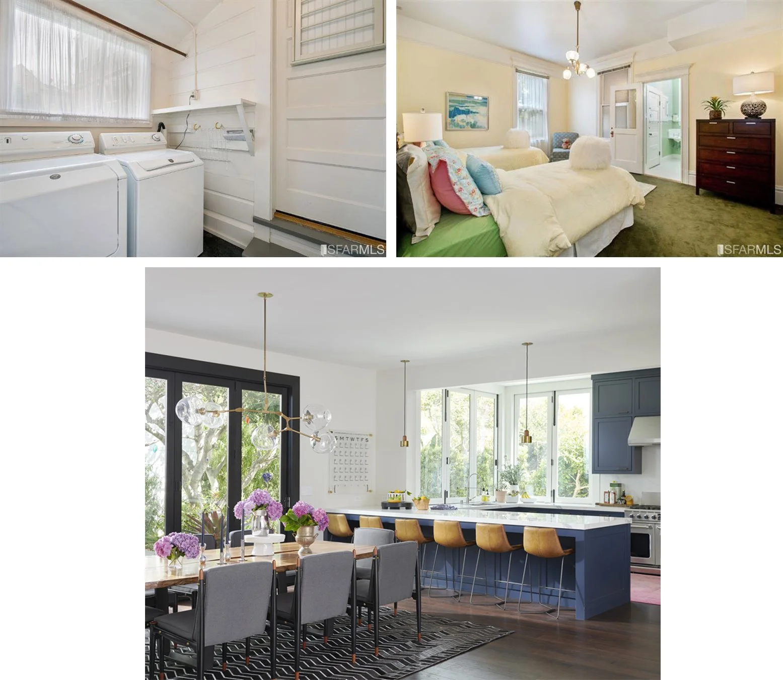
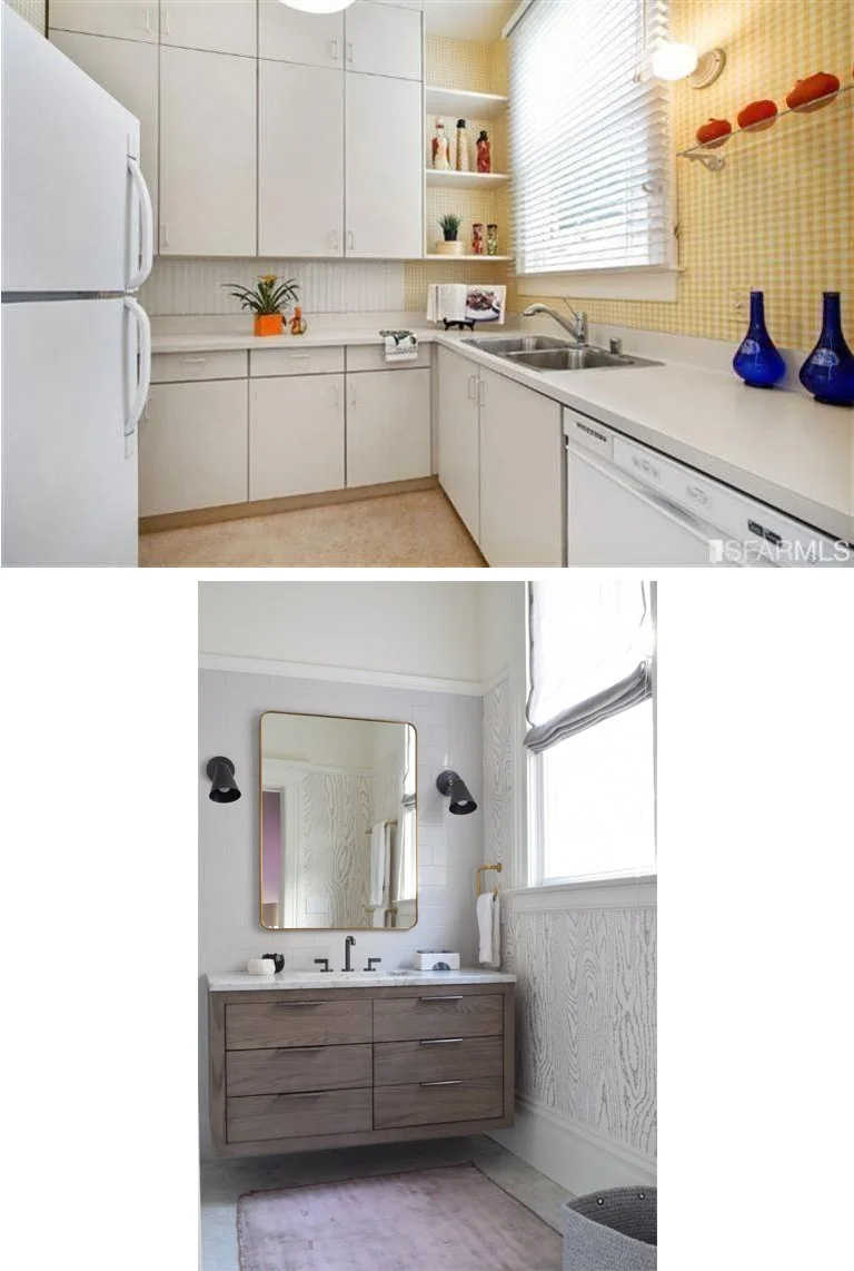
In the back corner of the house, there was a laundry room that had been tacked on at some point, with a much lower floor than the rest of the building. Next to it was a bathroom (green walls in the right photo below). Both got opened up and became the kitchen. With two walls facing in to the remarkably large garden, this is prime real estate!
After photo: Josh Grubbs
Living Room and Family Room
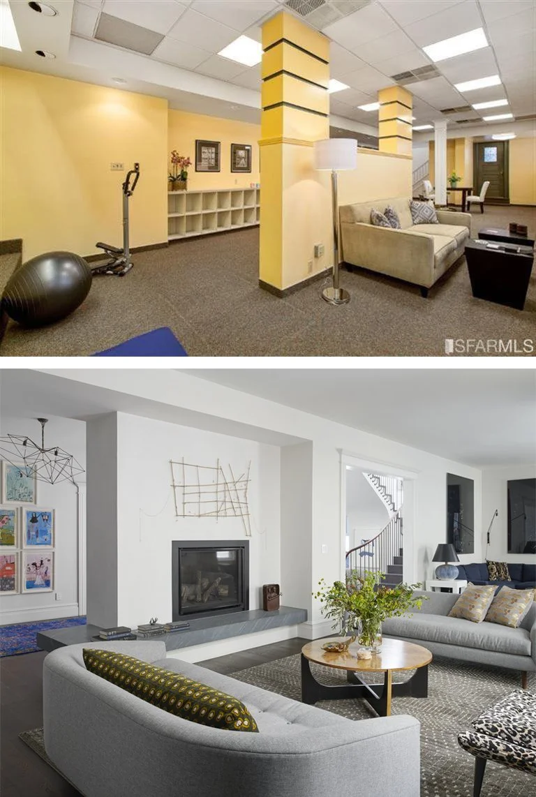
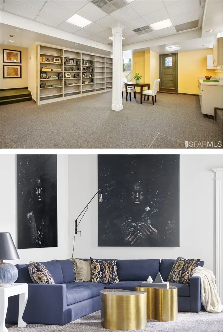
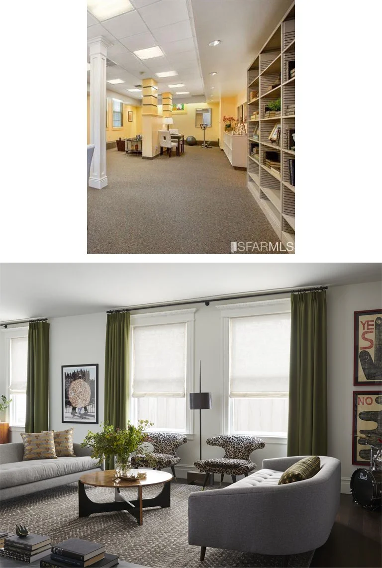
Half of the main floor was taken up by this records room. The long space remains structurally the same, though the floor was raised. We added a mudroom at the back and then programmed back to back living and family rooms. There are four windows on the long wall that act as a natural divider—2 in the front living room, 2 in the back family room.
These photos were taken from different positions, but they both show the living room at the front of the house. In the before photo, you see the two windows at the top left—same pair of windows with the leopard chairs, below.
Office
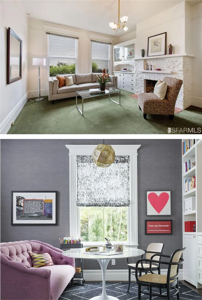
The home office is in the front of the house, off the entry. In the before photo, the right window is now in the powder room, the left window is depicted in the after photo, below. (the brick fireplace was removed.)
The front part of the home office occupies this space—the shape of the room and placement of door and windows remains. We added a built in where the mirror is in the “before.”
After photo: David Peterson
Pajama Lounge
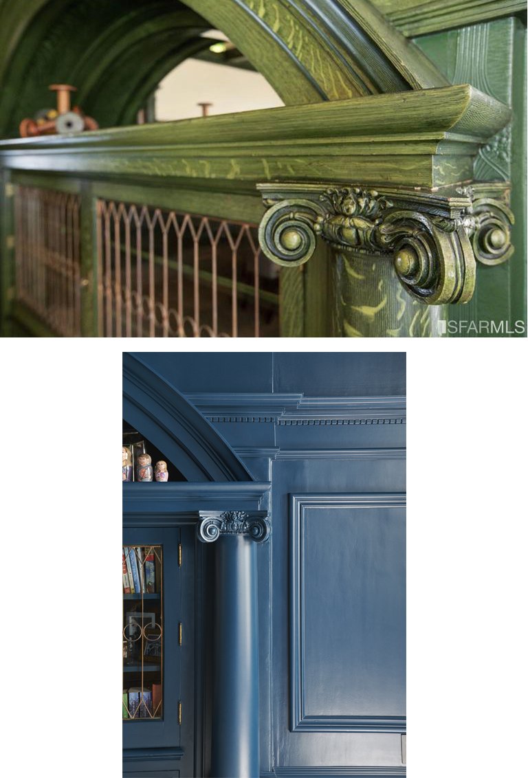
Upstairs there is a large and gracious room in the center of the home. It previously served as the dining room but has been repurposed as a family room, affectionately known as the Pajama Lounge. The doorways were reconfigured, with the one shown in the before photo now closed up to close off the son’s room. A large opening was created off the hallway, seen in the After photo below. A large dose of Farrow and Ball’s Hague Blue really modernized the beautiful coffered ceiling and built in cabinet!
After photo: Josh Grubbs
After photo: Josh Grubbs
The Upper Landing
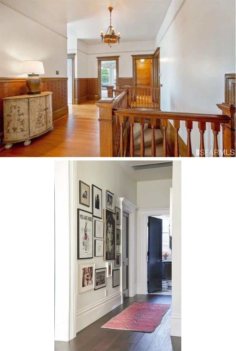
Here I’ll just point out that we kept the spirit of the doors and trim, but simplified and went for contrast, with white casings and black doors.
After photo: Josh Grubbs
Primary Suite
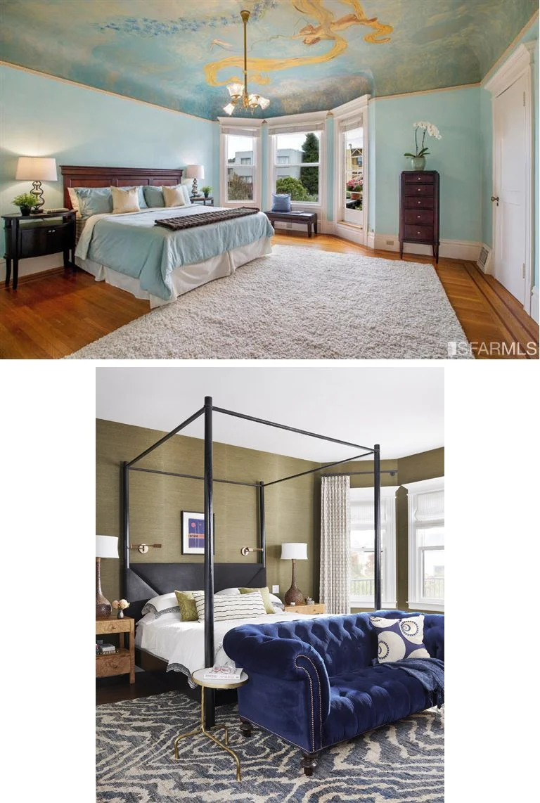
Painting out the ceiling mural had the biggest impact here, with cozy, textured olive grasscloth on the walls. The four poster bed is 8’ tall, helping to bring down the 10’ ceilings to a more human scale.
After photo: Josh Grubbs
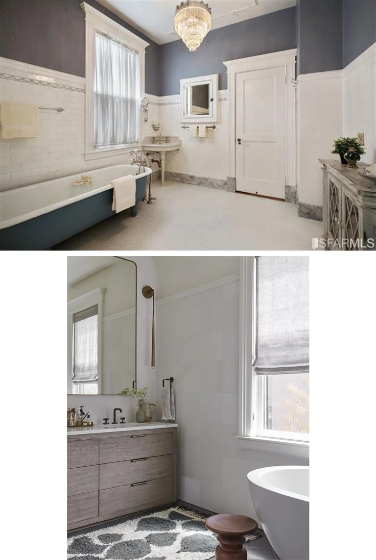
Different angle, same room. We preserved the wainscot but simplified with 12x24 marble. The freestanding tub maintained its position, but we brought in a sleek modern version.
Kids Rooms
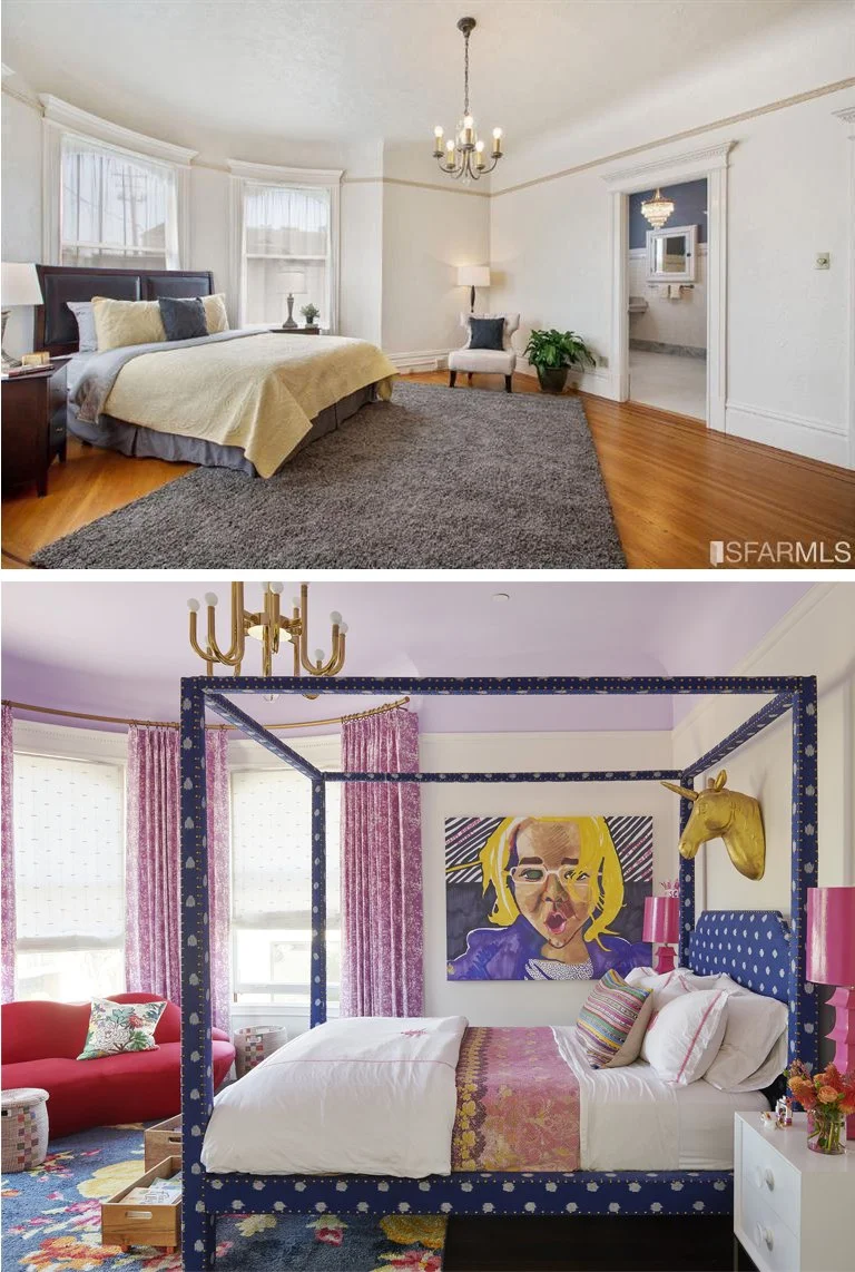
The two turrets at the front of the house are now home to the two kids. We maintained the cove ceiling and highlighted with paint—but with a calm, solid color. Drapery panels make the most of the windows, and the wide-reaching mouille-style light is a bold update.
After photo: Josh Grubbs
In the daughter’s room, same layout and similar strategy with the painted ceiling, drapery panels, and dramatic light. This is one of my favorite rooms in the history of rooms I have designed!
After Photo: Josh Grubbs
Guest Suite
This grand house had a tiny kitchen—which has now become the ensuite to the guest room. What was the breakfast room is now a bedroom.
After photo: David Peterson
What do you think? Quite a transformation! It was such a pleasure to get to work on the reimagining of this beautiful home. I always call it my Master Class in design!

