Before and After: Graphic Meets Organic
Did you see our latest project page reveal this week? Our Graphic Meets Organic project, located here in the Twin Cities, happened in stages over the past five years. It’s fun to finally share the before and after photos, to show you the full transformation!
Phase 1: The Porch
We tackled the porch first, and this is where we set the tone for the project with our mix of graphic, high-contrast patterns and warm, organic elements. We kept the red brick floor but layered it with a natural grass rug and crisped up the windows with black easy screens and bright white trim. We also flipped the furniture arrangement—there is an eating area across from the couch, just not pictured!
after photo: Spacecrafting Photography
Phase 2: The Powder Room
The powder room had not been touched since the house was built in the 1950s. We carried the graphic patterns of the porch into the black and white floor tile, and continued the contrast with a sharp black mirror against white shiplap walls. As in the porch, the natural wood tone on the vanity warms everything up.
After photo: Spacecrafting Photography
Phase 3: The Family Room
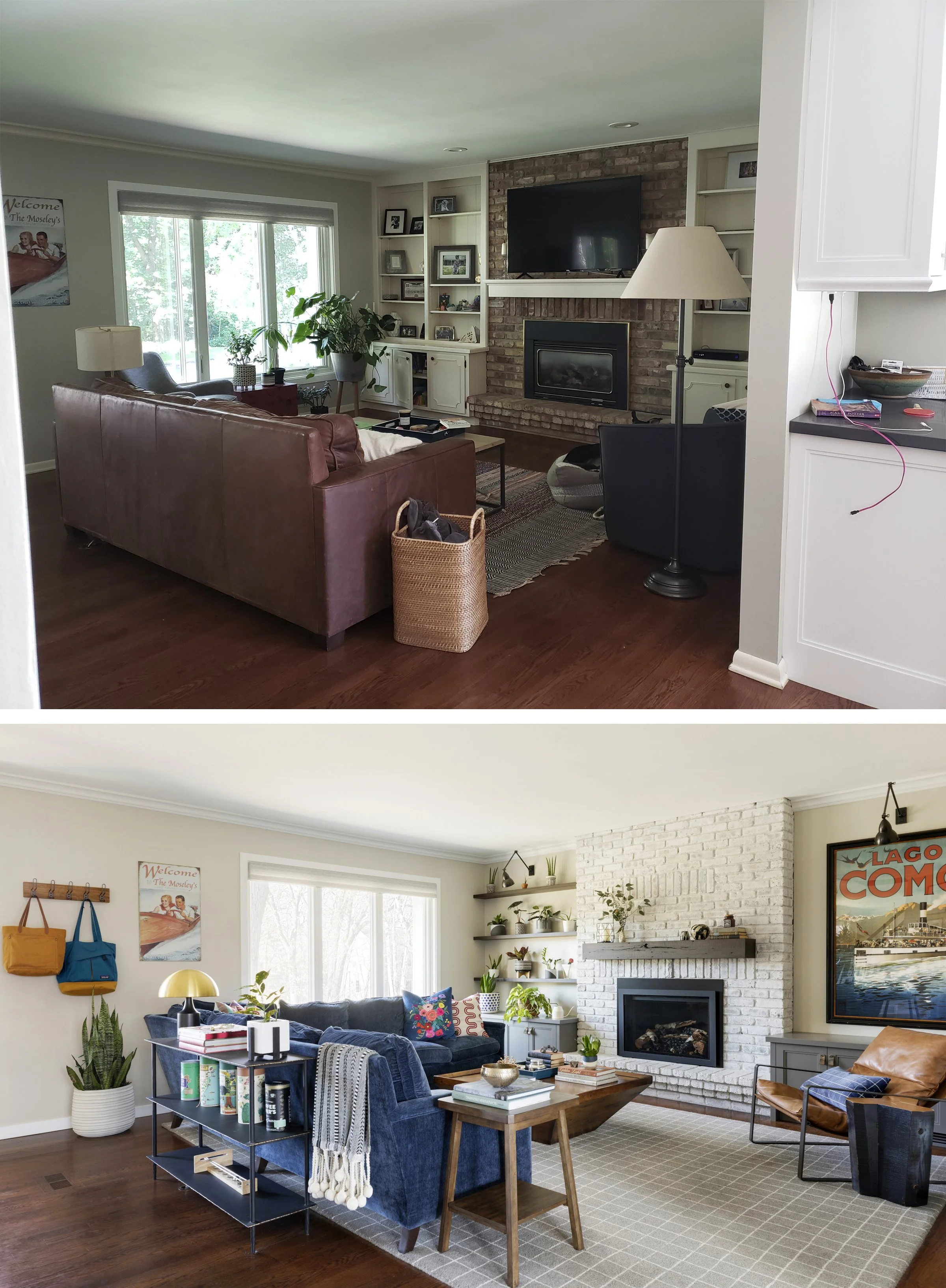
The family room is a nice big space, off the front door and connecting to the eat-in-kitchen. Our clients hated the dated built ins and didn’t want a bunch of clutter, so we took them out and simplified. Molly has a large (and growing) plant collection, so we gave her open shelving by a sunny window to house the smaller pots. For extra comfy seating, we used the largest sectional we could fit, but with trim proportions and not a lot of depth so it does not overwhelm the space. We also moved the TV off the fireplace and made use of the large blank wall to house it. To freshen the fireplace without replacing it, we upgraded the gas insert, whitewashed the brick, and simplified the mantel. A perfect case where small changes added up to a big impact.
After photo: Spacecrafting Photography
The other small change with big impact? Right-sizing the rug. The new, room-sized wool rug is great underfoot, anchors the larger furniture, and makes the room feel much bigger.
After Photo: Spacecrafting Photography
Phase 4: The Basement
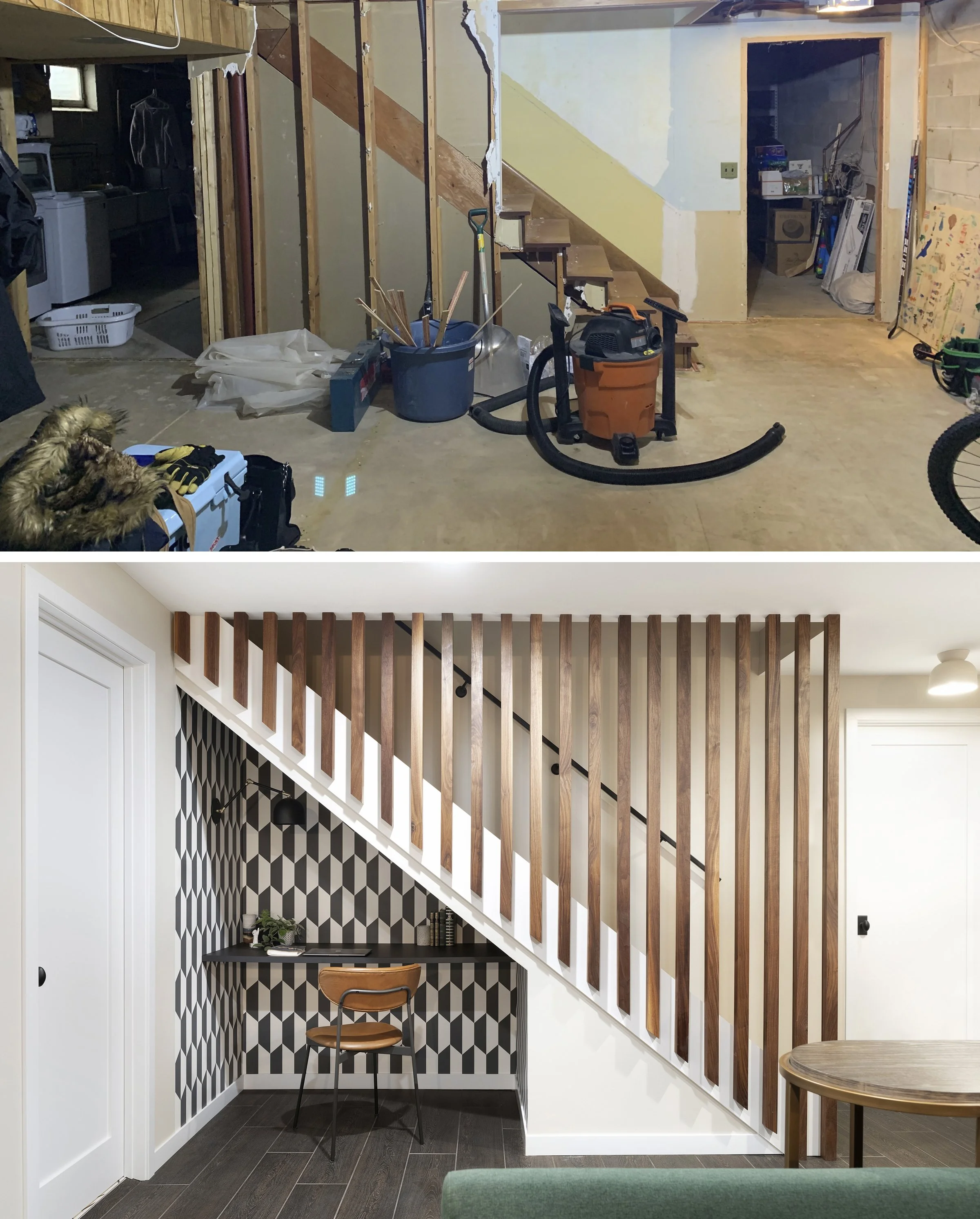
We recently completed a full renovation of the unfinished basement. The space still includes storage, laundry, and work-out rooms (not pictured), but we also upgraded the rec room and added a bedroom and bathroom. For flooring, we used a wood-look tile in a dark “stain” for a rustic-modern effect that is super practical. (The “before” pictures are actually AFTER the clients demoed the one finished portion of the basement.)
After Photo: Spacecrafting Photography
This might be my favorite spot in the house! We opened up the wall to the stairwell and turned it into a feature element with a walnut “screen.” We tucked a desk under the stairs and brought another strong black and white pattern to the walls.
After photo: Spacecrafting Photography
There’s no “before” of the basement bathroom since it did not exist, but you can check out the “After” and see more photos of this project on the website page, here. As always, our decisions here were guided by the wants, needs, and personalities of our clients. We love finding creative ways to incorporate YOU into your home!


