Before and After: York Avenue San Francisco
I was thrilled to have a project featured on House Beautiful online at the end of the year. If you follow me on instagram you have seen this project in bits and pieces over time. I am finally sharing the full before and after!
This house had an interesting trajectory. It was originally purchased by a man whose architect parents created plans for a very modern addition on the back of the Victorian house in the Mission District. When plans were complete but ground was not yet broken, the man got a job out of state, leaving the question: do you sell as is, or renovate as a spec house?
They chose the latter and created a beautiful tension of old and new, with a clean split down the middle. (At the same time, they skipped or skimped on some elements that would have developed differently as a personal project.)
When my clients bought it, the house was move-in ready. My design challenge was to unify the modern and the Victorian.
Living room and looking towards the entry, Before:
And after.
We added the built in bookshelf and window set with storage and filled out the narrow room with a sectional and small scale chairs.
Before:
There was an odd niche, one of those spots that would have been built in as a bar if the previous owner had stayed. Instead, we tucked in closets on both sides and comissioned a large scale artwork from New York artist Joan Grubin for the part you see.
Here is the After (a bench has since been installed under the art):
A peek in to the living room from the entry:
At the rear of the house the modern addition houses the dining room and kitchen. Dining Before:
Great bones! We extended the seating area and increased comfort with a pair of 6’ banquettes, a custom table, and an extra long light fixture. Dining After:
Through the window you see the side of the neighbors house. My clients cleverly installed a living wall with staghorn ferns since they couldn’t touch the actual surface!
On the Second floor, in the front (Victorian) part of the house, Before:
And After:
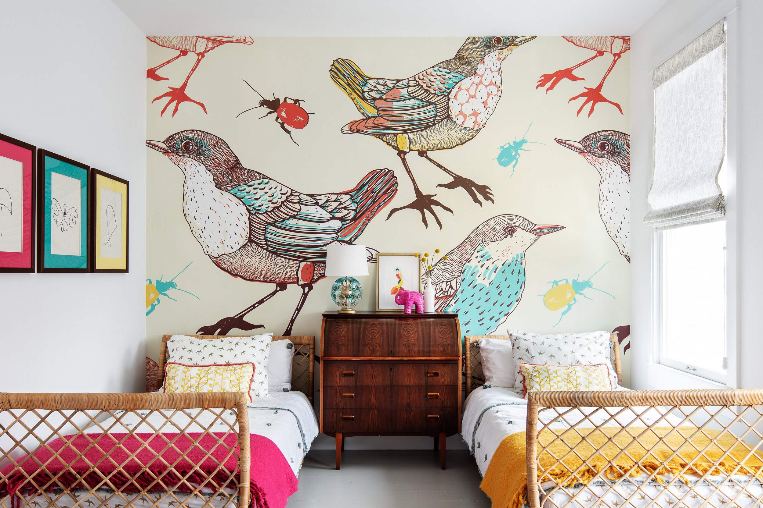
There is a history of murals in this neighborhood that we wanted to honor in the daughter’s room. We chose a large-scale birds and beatles theme with a Victorian bent, done in a modern way. This was the strategy through the front of the house: old things made new. Rattan is Victorian but the daybed shape is new. The rug is persian in design but digitally printed. For the chair, we chose a midcentury version of an antique wing chair.
Hall bath Before:
The renovation was well done but a bit sterile. We fixed that with a mega dose of color in the wallpaper. Hall Bath After:
Down the hall in the new addition of the second floor, Master bedroom Before:
Master bedroom After:
This room has a lot of cut-up walls. Instead of fighting it, we made it deliberate. One got studded grasscloth, another got ripplefold draperies, a third got a big leaner mirror and the fourth, not pictured, got a built-in closet system in walnut and white. Because this is the modern side of the house, we used contemporary pieces like the simple bed and etched rug. Mid-century pieces serve as a bridge for front and back.
Hall and stairs to third floor Before:
Hall and stairway to third floor, we energized both flights of stairs with a Missoni stair runner but kept it neutral in color.
After:
Third floor Before as guest room:
Third floor After (as home office and TV hang out space):
This was the last space we did and it came together effortlessly. I knew I wanted to “cap” the house with the most modern gesture, and that Kelly Wearstler blocked wallpaper did the trick! You can just see a peek of it from the front floor entry, giving you the full trajectory from the most Victorian part of the house to the most modern.
We did some work outside in the backyard as well.
It’s always a little bittersweet to close the door on special projects like this. There is talk of wallpaper in the powder room, though….
Before photos from the real estate listing
After photos, Thomas Kuoh Photography


