Designing a Home Office: Part 1
It has been a VERY long time since I have written an actual design post. With the one room challenge happening now, I thought it would be fun to take you through the process of designing one room! A home office feels logical in this time of quarantine and work-from-home. One caveat: unlike the one room challenge, this space will not be complete in 6 weeks. There are custom elements involved and everything is a bit slower with the coronavirus.
The Clients
A young couple in Connecticut with two small kids. He is a finance CEO and she is a former event planner and entrepreneur. They have been in their house around 5 years and have redone pretty much everything. I have helped with some things and not others, but I know their taste well. Fresh, current but not trendy, modern leanings on classic bones.
The Space
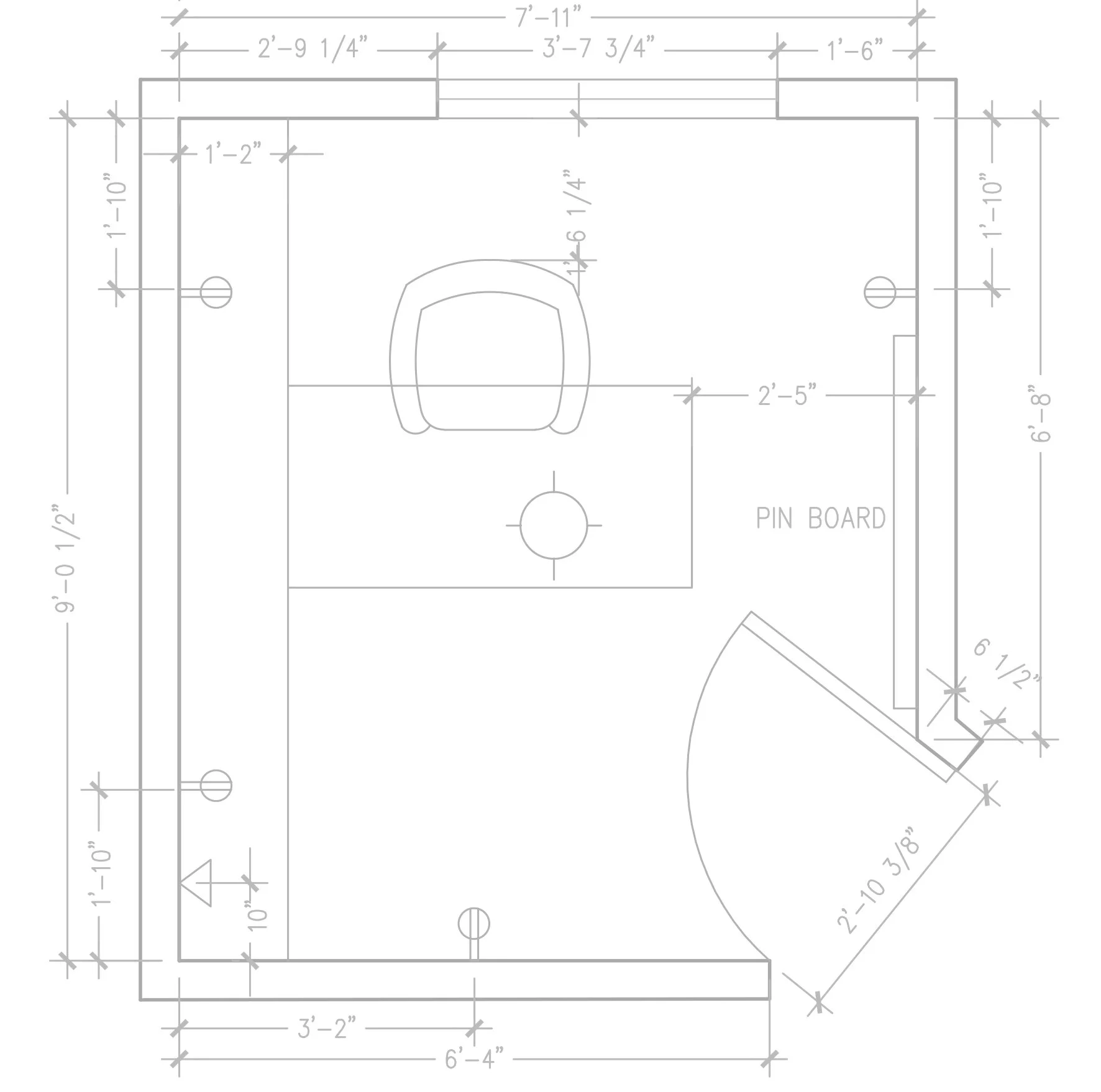
This awkwardly shaped room is off the entry hall, across from the stairs and powder room. My client painted it Navy for drama when they moved in, but now that she is spending so much time there she wants something light and bright and happy. The furniture was mostly repurposed from a previous apartment. We all have these “catch-all” rooms that are “good enough,” and as in this case, they are usually the last spaces to get some attention!
The Brief
Better storage, more function, possibly a second work station. Right now there is a small craft table in there but a kid station is not in the long-term plan, assuming the children will eventually return to school! We also wanted to address the siteline from the door and make sure what you see from the front hall looks great.
The Plans
We always start with layout to ensure the functional needs will be met. In this room, the wall where the desk currently sits is the logical wall to use as it is the longest and does not interfere with the door swing. There is also plenty of space to fit two desk stations. We tried a chair in the corner to add another function to the room (a kid could sit and read there while a parent works, for example), but it is pretty tight.
Of course we always like to investigate other options. Here I liked the idea of looking out the window. Orienting the desk along the front wall also leaves plenty of space for a reading corner with a comfy chair. (The downside? Only one workstation, plus a blank wall in the siteline from the hall.)
We don’t generally do elevations at this stage, but in the case of this layout we really needed to show how the built ins would balance out the off-centered window. It feels pretty charming!
I am also generally a fan of floating furniture in a room rather than pushing everything to the perimeter. We tried layouts with a desk floating in the room—more “executive suite”—but the angled doorway just meant walking in to the corner of the desk any which way we placed it.
In the end, we decided the desk wall was in the right place. Sometimes the placement is already there, but the pieces need tweaking.
Next Up
Next time we will take a peek at the elevations on that focal wall, and talk through the plans for the built-ins. You will see how the layout can really speak to different functional needs but also define a design language—we had some more modern and more traditional options, not just in cabinet style and material but in the layout itself.
See you next time!


