Designing a Home Office: Part 2
Hi there!
We are back with the next round of work on this home office in Connecticut. Did you see the first post?
We left off with a floor plan for the space and today we are looking at elevations on the key wall. Remember we want to deliver storage and function but also make sure this wall looks great since it is a site line from the front hall.
The Plan
Here’s what we chose:
The Elevations: Big Picture
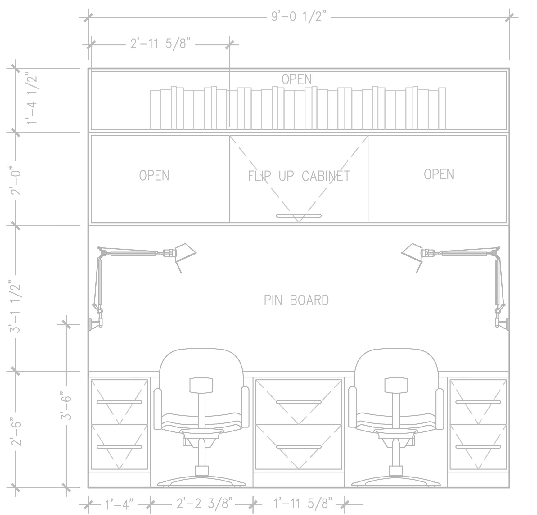
Now it’s time to look at that wall in elevation.
With two desk stations, we didn’t want to close them in. So instead of flanking the desk areas with storage as in the space now, we moved the storage to a row of uppers. Making everything horizontal leaves elbow room. We also like the opportunity for an aesthetic focal point behind the desks—originally we thought the space behind the computers would be wall to wall pinboard, but after dialing in on what the pinboard is needed for we realized we could split the function and go for beautiful wallpaper here instead.
Now, personal effects (family photos, holiday cards, etc) will go on a large pinboard on the opposite wall, where it will be more private. Practical things that are shorter term, like receipts and reminder cards, will go on a magnet strip on the wall adjacent to the desk stations.
Yay for wallpaper!
Task lighting was also high on the needs list. We are considering under cabinet lights but this set up also allows for wall mount swing arm lights.
Function: Lower Cabinets
Often there are multiple options that will look and work great, and the preference for one over another is really just personal. Here there was a tradeoff: leg room versus drawer space.
Ultimately we agreed that legroom was more important since most of the within-reach needs could be solved on the one bank of drawers or with other desktop solutions.
Form and Function: Upper Cabinets
All of the cabinetry in the house is a traditional shaker style. I liked the idea of a departure here, with modern flat fronts that lift up. The horizontal line widens the space and the combination of closed storage to hide clutter with a long span above for display and books feels tidy and modern. I also don’t love a bunch of empty shelves that you feel like you have to fill just to fill—here, the space above the uppers could remain empty if there was nothing to display.
However! After spending some time thinking about it my client realized that the lift-up cabinets would not be the best function for her needs, so we started playing with more traditional uppers. Once we went with a more traditional look, it felt good to add slim pencil drawers at each station, so we ended up with leg room AND additional usable storage.
At this point we knew we were close and that adding the aesthetic layer would bring our decisions forward.
Next Up
Next time we will look at mock-ups of this wall to understand how stain, pattern, color, and initial furniture selections influence the view.
I hope you are enjoying this peek behind the scenes. So much thought goes in to every thing we do, and we work hard to bring the client along so they always understand the “why” and know that we are hearing them. We know what works in a room, but you know what works for you.
See you next time!
p.s. The thumbnail image on the blog landing page has nothing to do with this project but is a good example of a custom cabinetry elevation. To see more of that project, go here.


