Before and After: Charming Meets Colonial Decorating
Did you see our previous post Before and After: Charming Meets Colonial Construction? If not, go check it out before proceeding. We’ll wait.
Now that we’ve covered the renovation of this Edina Colonial, we are sharing before and afters of the decorated spaces. Shall we?
Living room
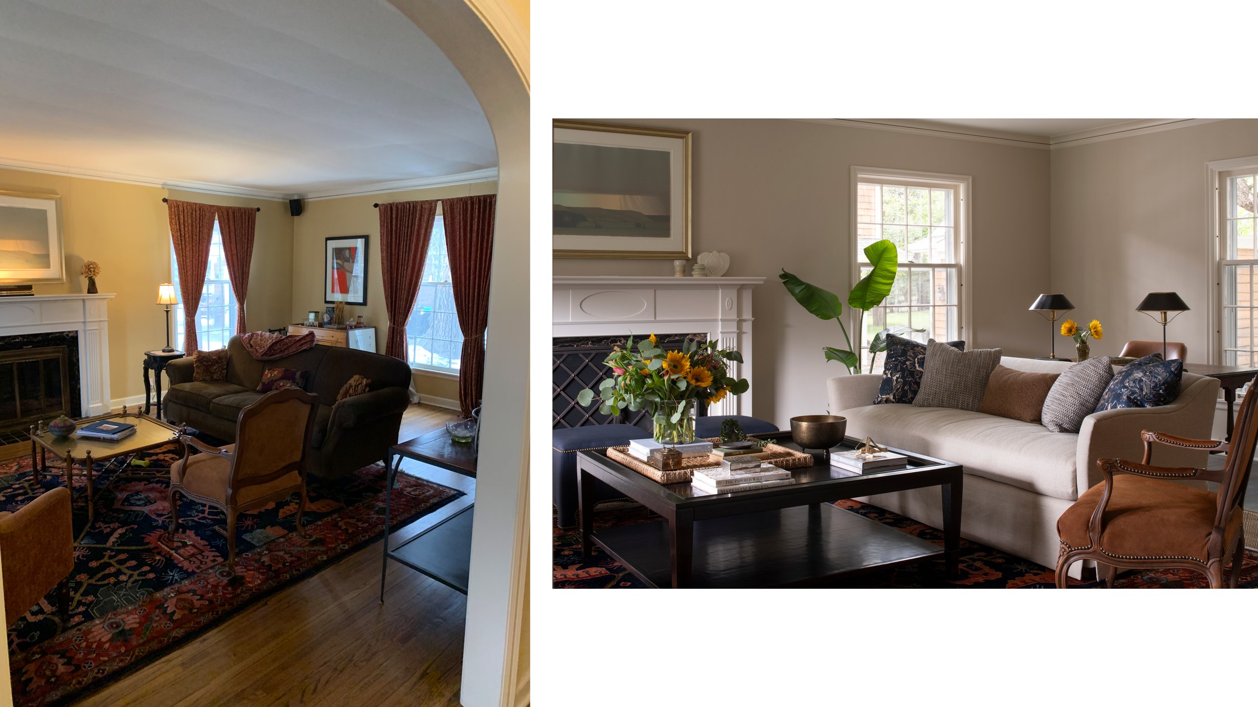
This is a classic center-hall colonial. When you enter, the living room is to your left and the dining room to the right. I love this before and after because it shows how we embraced what was working and what we did to refresh and elevate the space. The dark floors and cream walls are a lovely high-contrast that celebrates the architecture. We kept the rug, reupholstered the chairs, and stripped the windows to creat a calm simplicity.
Living Room
We right-sized the coffee table and couch and tucked an antique table behind to create a work zone. I love the simple elegance of this skirted sofa!
Dining room
In the after photo, the new large opening to the kitchen is to the left. The dining table now runs perpendicular to the island, which creates great flow to the sunroom beyond. One of our guiding principles was to find pieces that were formal enough for the house but informal enough for the family that lives here. The dining set is a classic with simple lines. The artwork is the same artist as the large piece in the living room and felt destined for this spot.
Sunroom
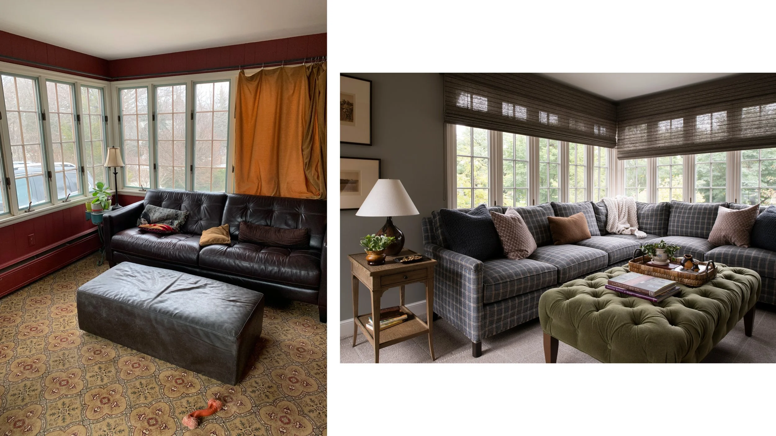
This one speaks for itself, no? The corner sectional and large ottoman fill the room perfectly and maximize seating for entertaining or TV. It’s also a great example of how effective it can be to use neutrals on the walls but bring color to the furniture.
Primary Bedroom
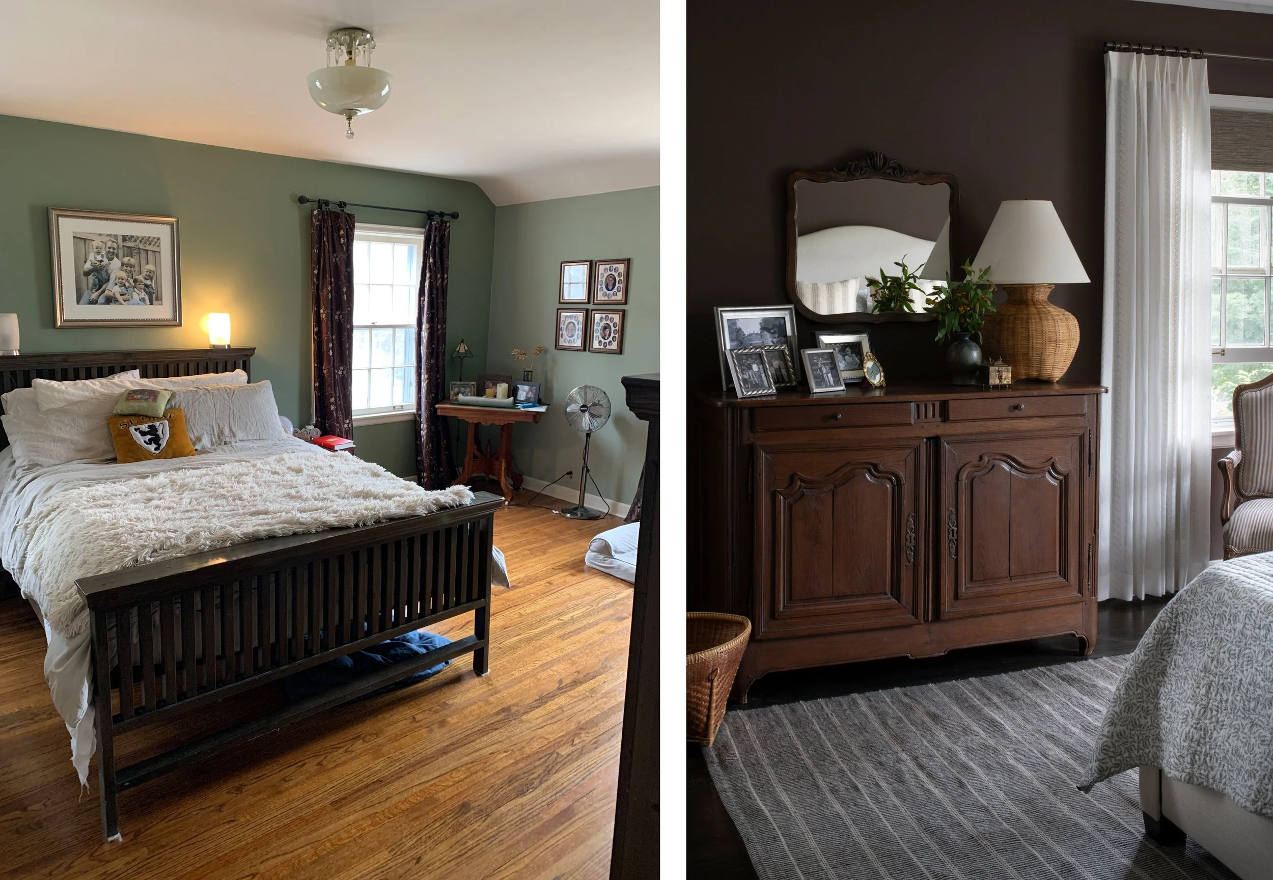
Mood shift! We often incorporate a more saturated room in our projects. In this case, it was a late addition to a bedroom that was originally slated to be cream. I just love the drama of the bittersweet chocolate walls with the light fabric elements. The mirror is a family heirloom and the sideboard is a french antique we found locally. I’m a big fan of displaying family photos in personal spaces! It’s also fun to see that corner table in the Before, which landed in the dining room and serves as a bar.
Twin room
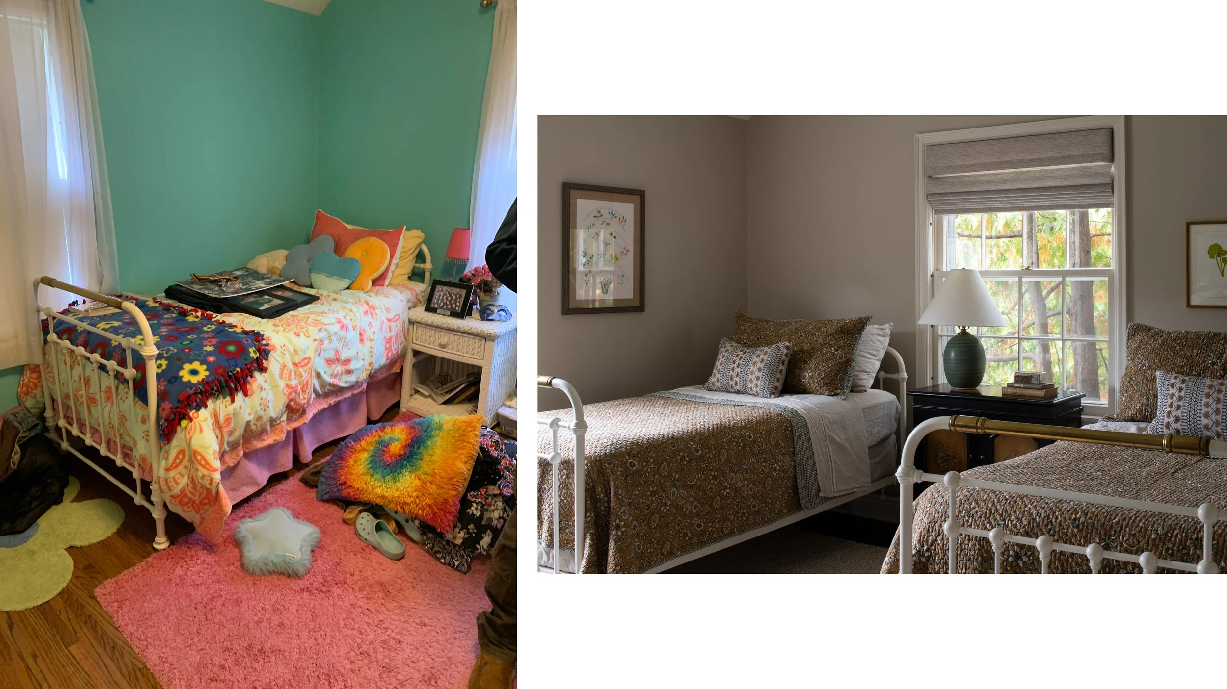
This bedroom was not in the original scope but became a fun bonus. We loved the pair of antique twin beds, which we dressed with a mix of cottagey textiles and paired with a vintage cabinet from the clients garage and a lamp we had in our inventory! Once you have the vibe down, it can be easy to pull secondary spaces together.


