Before and After: Charming Meets Colonial Construction
We know you love a before and after, and this is a good one! Our clients had lived in their Edina Colonial for over 15 years and raised their four kids here. Rather than downsize, they decided to give the home some love and make it work better for them and their next phase of life. They had previously worked with Mark Larson of Rehkamp Larson Architects to design their cabin and they brought him back to reorganize the lay out of the main floor and address the bathrooms on the upper level, all of which were stuck in the past. We’ll talk renovation today and decorating next time.
Opening up the Kitchen
These photos are deceptive because they are different angles. The fridge in the before photo is on a wall adjoining the dining room—a wall that was removed to create better flow and allow for the addition of an island. The after is taken from the dining room.
Breakfast nook
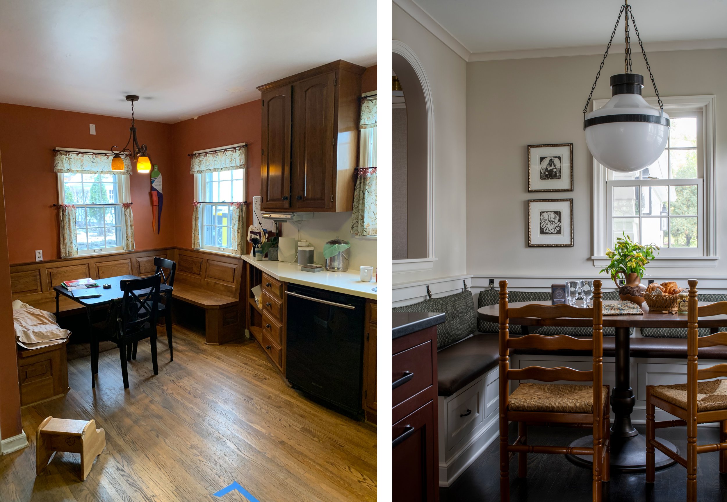
The built in eating area was a family favorite, and a great place for piling in diners at holidays. We kept it but gave it an upgrade and better integrated it into the cabinetry at right. The arched window is new and looks into the back hall. We love the statement light fixture, vintage chairs, client’s own art, and of course the custom banquette! The back cushions are suspended from marine clips.
Hard-Working Buffet Wall
With the range relocated, this wall became hard-working storage, with a pantry at left, coffee bar at right, and space to serve in the middle. We love the way RLA dropped the uppers back to create dimension, and added glass and fabric to create additional interest. Antique mirrored backsplash reflects light from the windows.
Main Floor Powder to Full Bath
In addition to the aesthetic upgrade, this bathroom got a major function renovation with the addition of a walk-in shower. The beadboard wainscoting feels appropriate to the era of the home and adds a ton of charm. My favorite thing might be that little antique mirror; we originally dubbed it too small for the space, but now the petite proportion is one of my favorite things!
Primary Bath
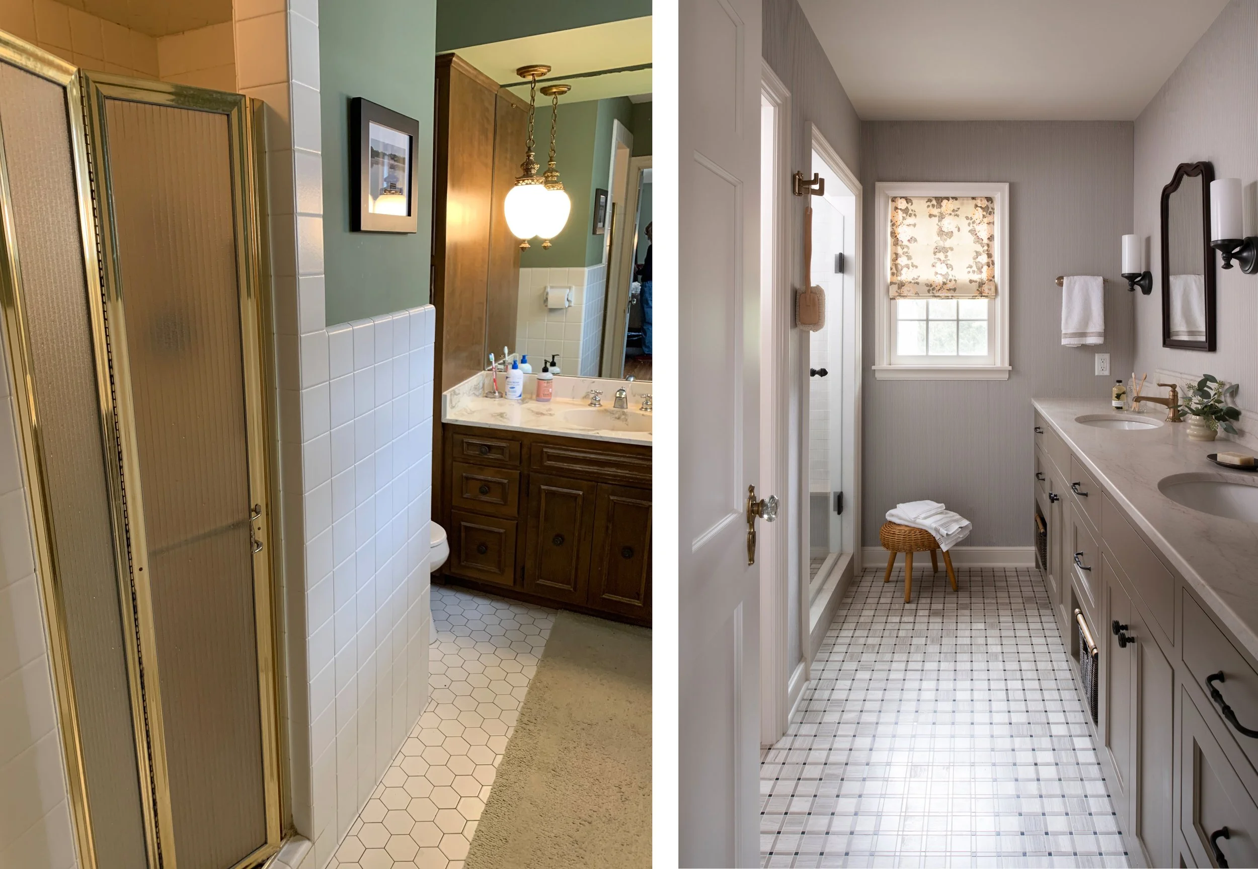
The primary ensuite may have benefitted the most from the re-organization. The space now boasts a double vanity, an enclosed Water Closet, AND a new window. We kept it classic with a tailored stone floor and painted cabinetry.
Hall Bath
This windowless bath at the top of the stairs was also re-oriented so you look in to the lovely walnut vanity, not right at the toilet. The Zak + Fox wallpaper is moody but lively, and we love how it incorporates the palette from much of the house!
This renovation was completed about a year ago, and we recently heard from the clients, who told us: “Our deep gratitude for your wisdom, guidance, expertise and artistic taste continues as we enjoy the renovated space we get to call home.” Exactly how we want our clients to feel over the years!


