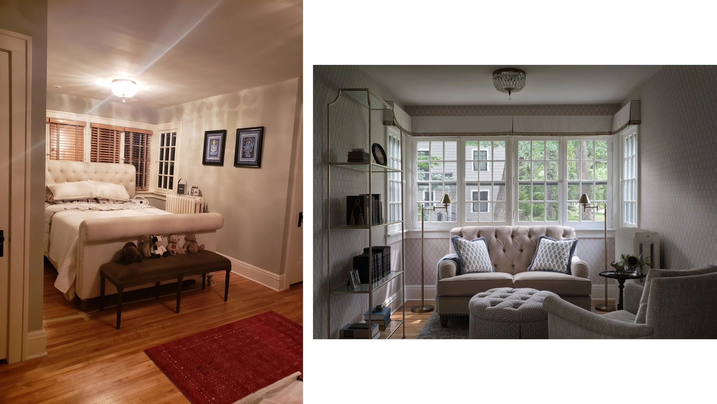
Before and After: Tailored Meets Bohemian
We all love a good before and after, don’t we? You may have seen this dining room posted to Instagram this week. Today we are sharing more of the home.
This is a lovely brick Tudor with great bones. We were originally brought in to work on the suite of public rooms on the main floor: Living, dining, and sunroom/ den. Over the course of two years, we added the rest of the house! Some rooms were designed from scratch, others were refined using the existing pieces. In fact, when we first saw the place I thought, they don’t need me! Just goes to show that you can have a good start and there is always room to add and elevate.
Dining Room
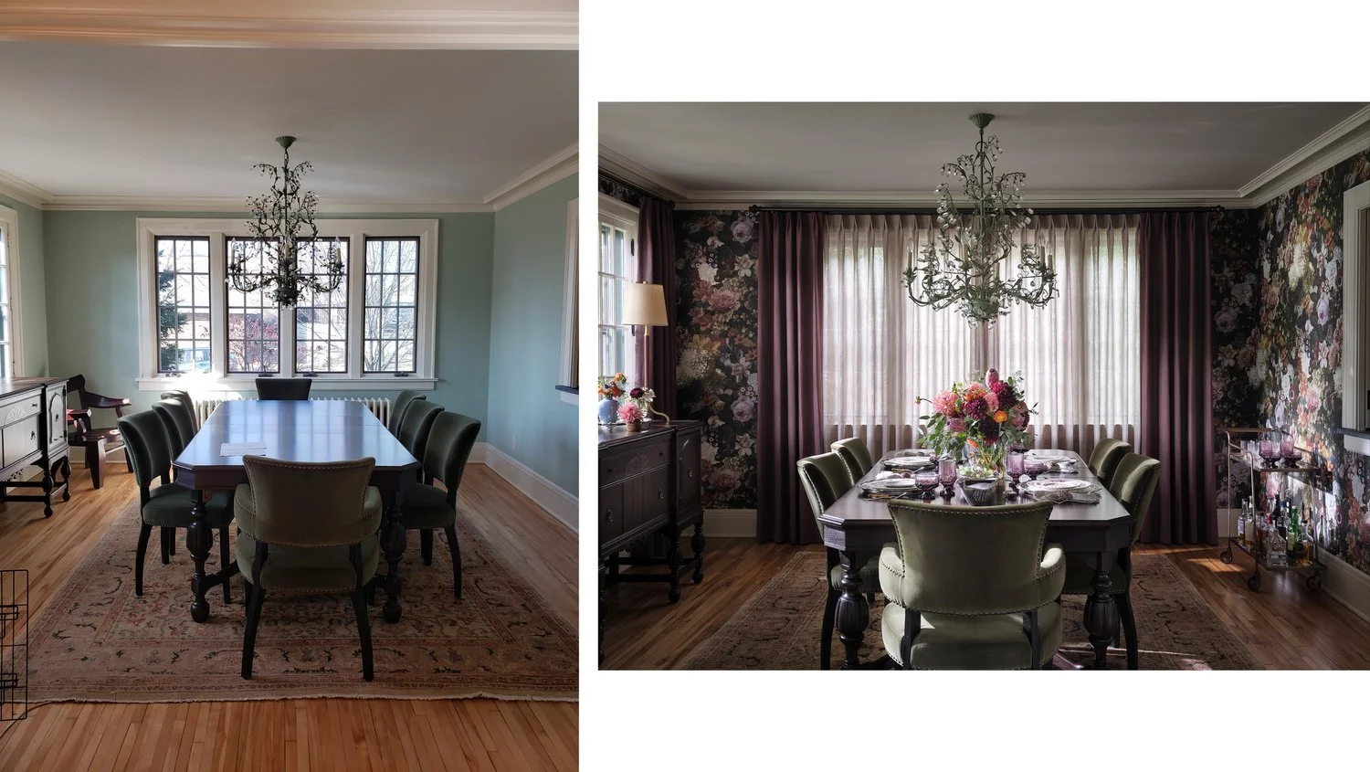
The antique dining table and buffet had recently been refinished, the rug had a good palette to work with, and we all adored the pre-existing chandelier. The dining chairs were in good shape, and it is one of those items that can eat up a budget quickly, since you need a lot of them! We kept it all and created a real sense of mood through the dense floral wallpaper and plum linen drapes. We added a little modernity with the leather buffet lamps and 70s inspired bar cart.
Living Room
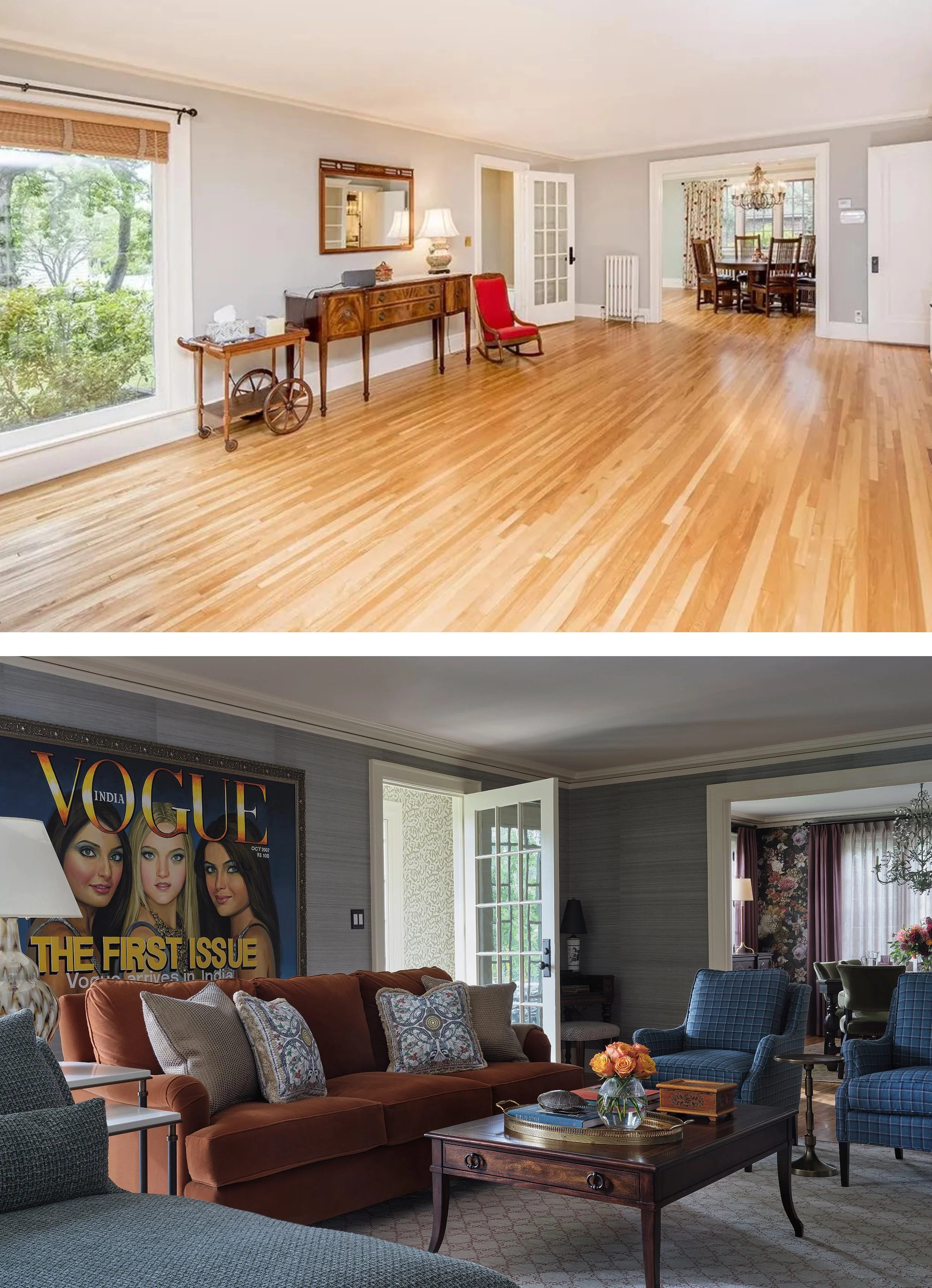
The living room anchors the main floor, with openings to the dining room and sunroom, plus doors to the entry and kitchen. We placed an orange velvet sofa facing the fireplace and flanked it with varied seating: a chaise lounge in a beautiful chunky fabric, and a pair of trim armchairs in teal plaid. The space is swathed in silk wallcovering, which gives a beautiful sense of movement. The Vogue painting is something the couple picked up in India when they lived there.
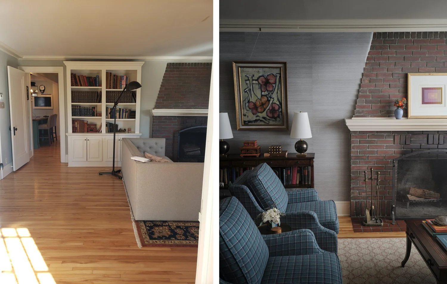
The built in to the left of the fireplace was bulky and threw the room off balance. We removed it but added storage back in with a console table with shelves for treasured books. This also gave us an opportunity for additional lamps. Like many houses of this era, the living room has no built in fixtures.
Kitchen
Off the living room you can peek into the kitchen (as seen in the before photo just above). This had been recently renovated and the layout and materials were great. We just tweaked a few things to make it connect to the rest of the design. The island got a dose of navy paint (BM Hale Navy), the backsplash got a major upgrade with gorgeous painted marble tile from Jeffrey Court, and we simplified the window with a single, motorized roman shade from Union Place in a beautiful white embroidered fabric. Curved-back mohair bar stools don’t hurt anything, either.
Sunroom
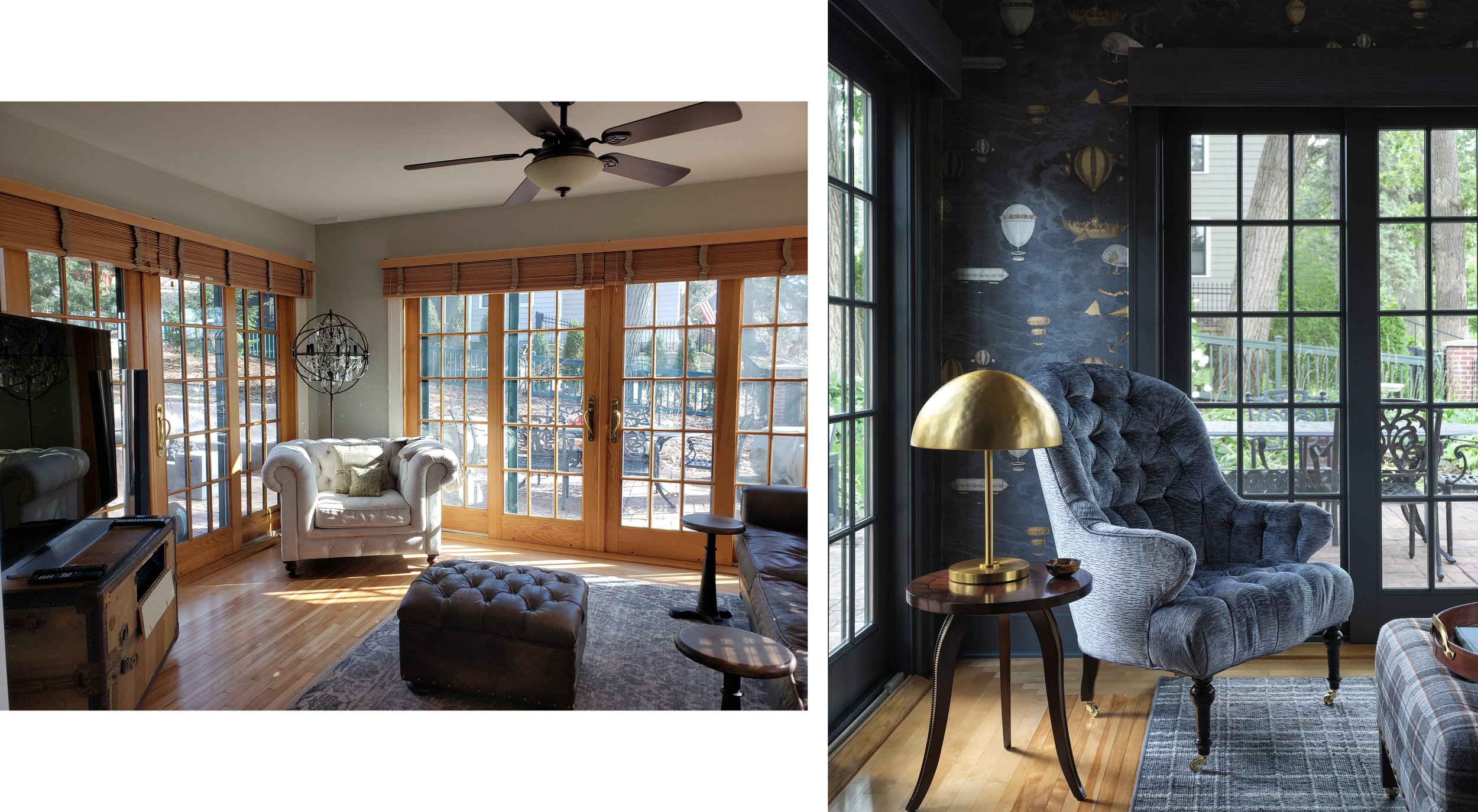
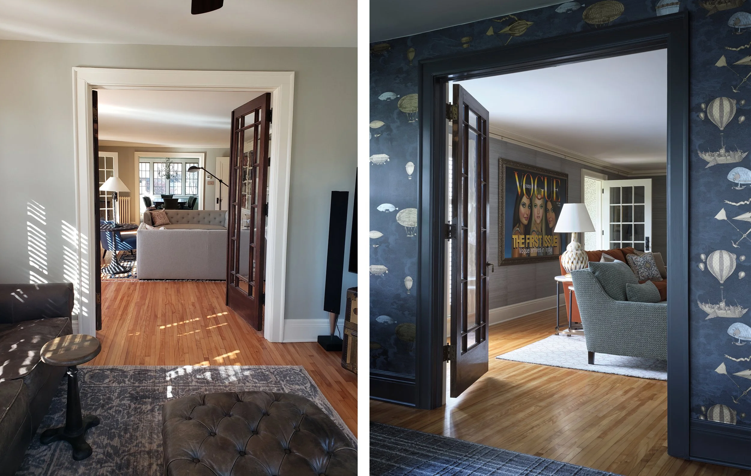
While this room is surrounded in windows and has access to the patio, it is used mostly as a den, and is the primary TV spot. As such, we gave it a major mood shift! The doors were not original to the house and they were the only thing in the house with this wood tone, so we happily painted them all a deep charcoal, keeping it tonal to the Fornasetti wallpaper (one of my long-time favorites!) I love the masculine play of plaid fabrics and the handsome accent pieces.
A peek at how these rooms connect.
Home Office
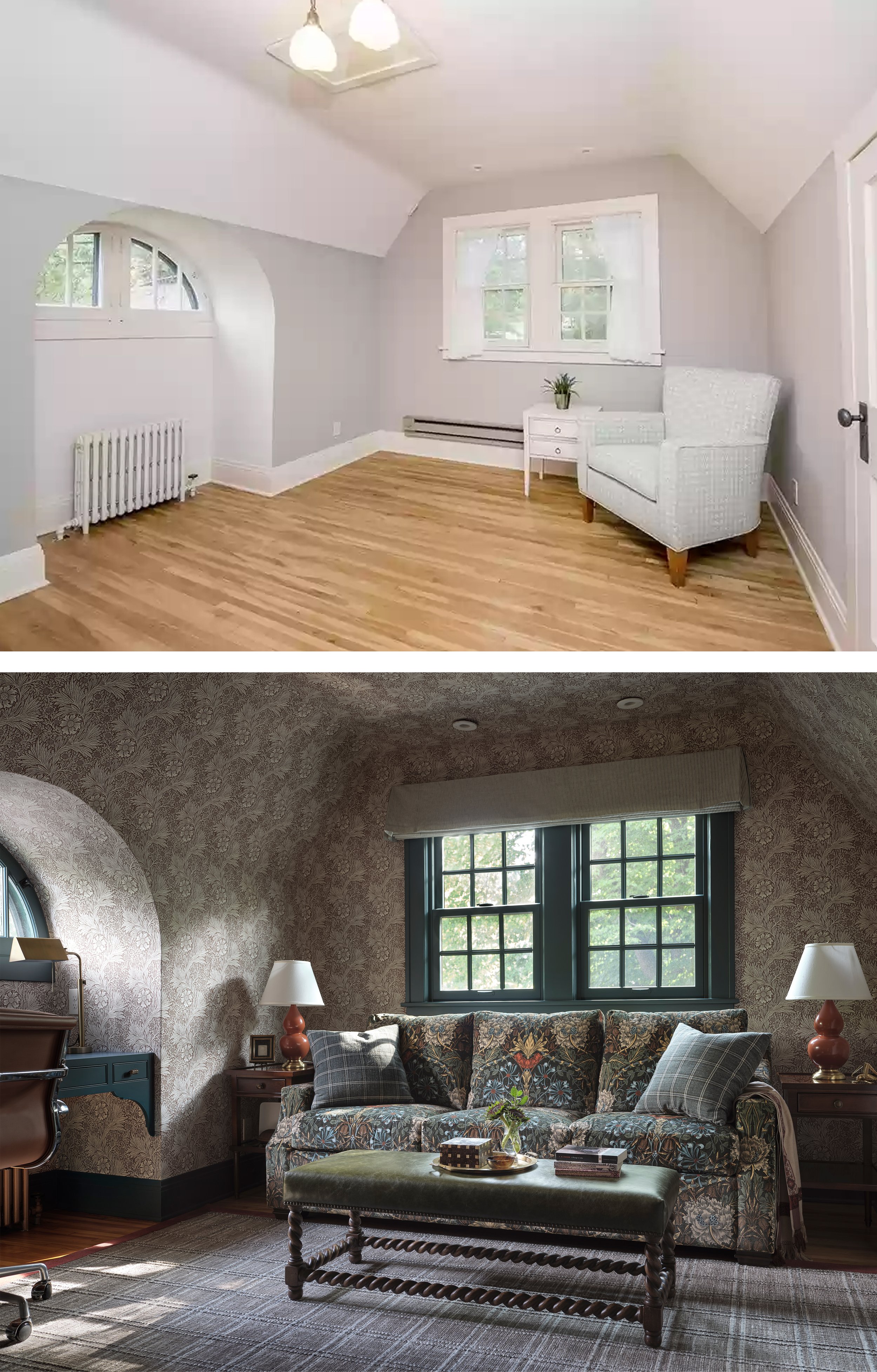
The single biggest transformation came in her home office, a former guest room over the garage. The space had so much charm and potential! Using a busy William Morris wallpaper on walls and ceilings helped erase the odd angles and created a real sense of coziness. The painted trim—actually one of our LAST design decisions—shows off some architectural features, including the ones we added, like the floating desk that makes great use of an otherwise wasted nook. To keep the functionality of a guest room, the sofa is actually a very comfortable pull out bed.
Hall Bath
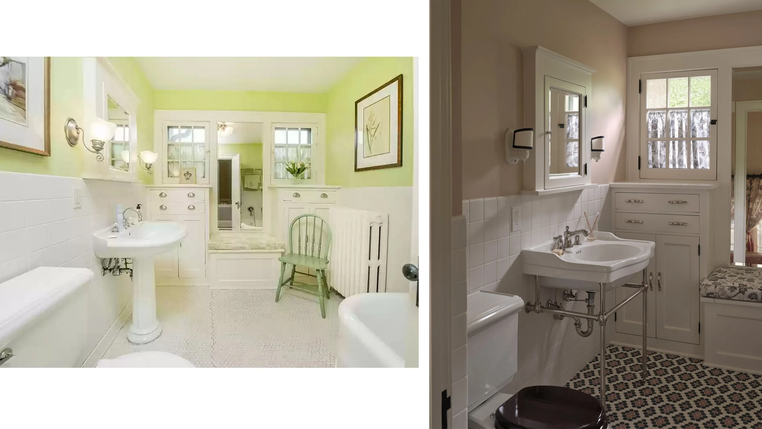
Cracked floor tile kicked off the renovation in here. We kept the spirit of the space and the original built ins and medicine cabinet, but amped up the charm with a historic tile floor in a multi-color pattern. We also love the mahogany toilet seat cover! Walls are Setting Plaster from Farrow and Ball.
Home Gym
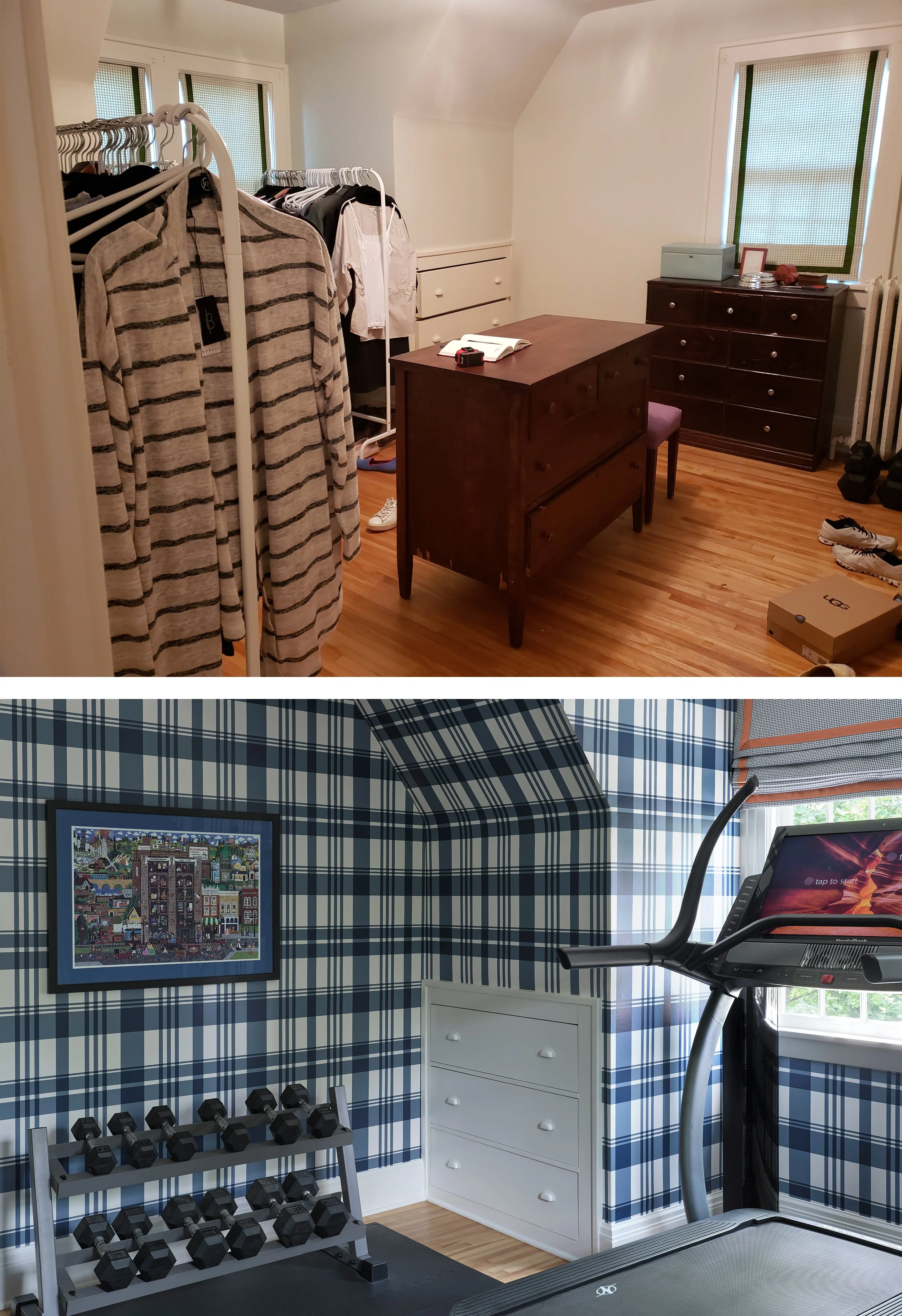
Though used as overflow closet space when we first encountered it, this is truly a guest bedroom. The design work happened during Covid, and the clients have no kids so we encouraged them to program the extra bedrooms for their varied needs. The bold wallpaper was all this space needed to come to life! If they ever want to convert it back to a bedroom, they will be halfway there.
Primary Seating Area
Besides the obvious layout shift, this transformation was largely due to wallpaper and textiles once again.
Overall, I would say the MVP in this house is wallpaper, for sure. We worked in phases, but designed phase 2 before phase 1 was installed. At one point, as the wallpaper list grew, the wife said “I sure hope I like wallpaper?” Guess what? She loves it.
To see the rest of the photos of this project, go to our Tailored meets Bohemian page.

